Case Study With Meridia CU
SEE IT LIVE
Background
Meridia Community Credit Union was founded in 1955 and is headquartered in Hamburg, New York. Meridia “Goes Beyond” expectations and helps its members rise above ordinary. Accordingly, they wanted to create the best credit union website experience to match their brand: a credit union website that exceeds expectations.
Our relationship with Meridia started when we sent them a box of Mexican jumping beans.
That got their attention–maybe because they thought we were weird! The box also included a handwritten note inviting them to talk with us about redesigning their website. We talked. We laughed. And in January of 2016 we started the redesign project.
The Starting Line
Our point of contact at Meridia is Annette. She’s a rad lady. We started the redesign project by asking Annette questions to understand Meridia’s situation and talk about must-haves for the new credit union website.
Our first question for Annette was, “What do you like about your current website?”
She answered, “We have a new processor,” and that’s all Meridia liked about their website. “What do you not like?” we asked. This time her list was longer: “We rebranded a little over a year ago and feel like our website doesn’t reflect our brand.” She continued, “The site is busy, incohesive, and hard to navigate. And we can’t make very many changes with the site’s content management system.”
“The site is busy, incohesive, and hard to navigate. And we can’t make very many changes with the site’s content management system.”
Annette Olday
Meridia wanted to design a new, simple experience that represents its brand statement, “We Go Beyond.”
Ultimately, the new website needs to “attract new members” and “deepen relationships with current members.” Our goal was to design one of the best credit union websites in the world.
Meridia’s Old Website
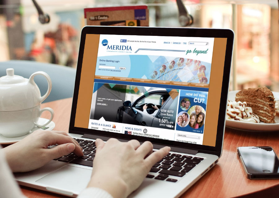
We did a User Experience Review to evaluate MeridiaCU.com from the perspective of two personas, Kate and Adam (see Meridia’s UX Review).
How We Guaranteed a beautiful Credit Union Website Design
Following the four principles below produced a gorgeous credit union website design for Meridia.
Principle 1:
Start with Content, Not Design
The most counterintuitive part of design is the fact that a great credit union website design starts with content, not design. The purpose of a website is to say something that persuades action. Content is WHAT you say and design is HOW you say it. If you start with design instead of content, inevitably you end up with poor messaging or an ugly website (maybe both).
First, we needed to determine what MeridiaCU.com should say, then use design as a vehicle to display Meridia’s message. Therefore, we began MeridiaCU.com’s redesign by constructing its website navigation and page content outlines.
Navigating Website Navigation
Simple website navigation is vital to a flawless user experience because finding information should be easy. We asked Annette, “Why do people visit MeridiaCU.com? What information do your credit union website visitors need?” Responses to these questions were listed, discussed, and grouped by topic. After grouping the list items, MeridiaCU.com had a well-organized navigation structure and sitemap. Voilà!
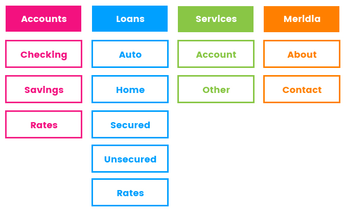
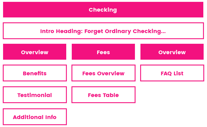
Page Content Outlines
After creating the sitemap, we had an inventory of all the pages that needed to exist on the website. Next, we needed to outline the content for each page. We grouped pages into Types, each Type having a unique set of content elements.
Example: All product and service pages had the same content elements, while rates pages had different elements; therefore, Products & Services and Rates were two different Page Types.
Page Types included Locations, Contact, Rates, Search, News, Products and Services, and the Homepage. Organizing pages into Types made the website consistent and easy to navigate.
Next, we outlined the content for each Page Type using communication strategies designed to persuade action. For instance, all product and service pages have Position, Benefit, Evidence, and Call to Action elements.
Principle 2:
Discover Design Style and Role Models
With the navigation and page outlines in hand, we were ready for Design Discovery. Design Discovery consists of creating a style guide and choosing role models.
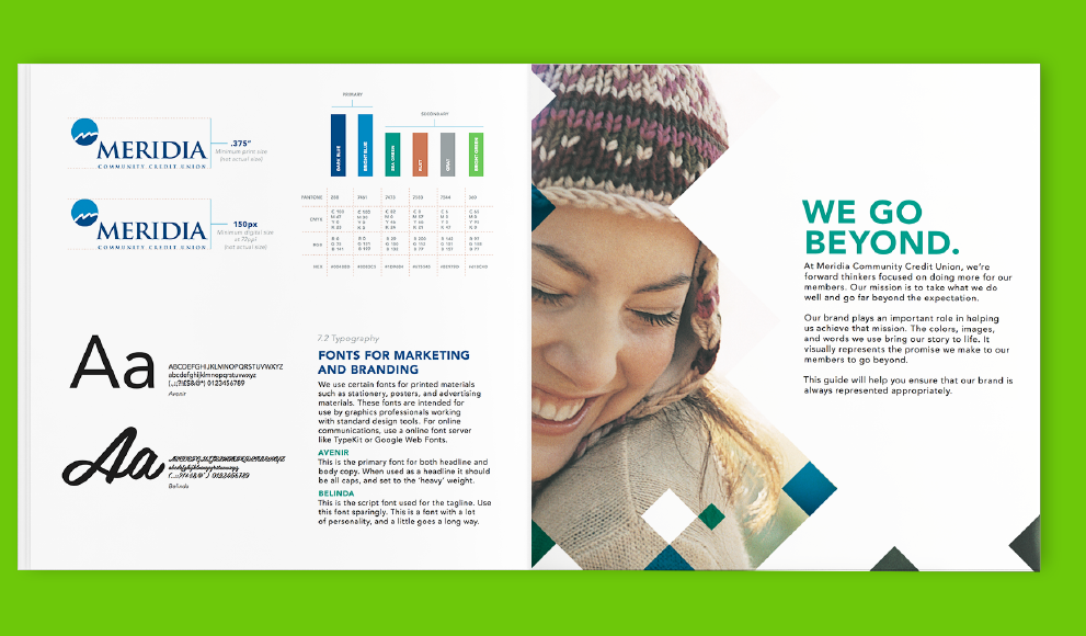
Style Guide
A style guide delineates which fonts, colors, images, and graphics to use to portray a brand. Meridia had a style guide before approaching BloomCU which largely influenced the look and feel of its new website. Having a style guide was a huge win because it facilitated the website design process.
We highly recommend having a style guide before starting a credit union website design project. If you don’t have a style guide, we can help you make one.
Choosing Role Models
Having a role model is a schema humans use to make decisions. If you want to be a great basketball player, then you imitate Michael Jordan. Christians do the same with Jesus, hence the popular question, “What would Jesus do?”
The role model schema holds true for credit union website design, too. We looked at lots of different websites with Annette to determine who Meridia wanted to be like. Boxeldercu.com (2016 CUNA Diamond Award Winner), huecu.org, and alliantcreditunion.org became role models for MeridiaCU.com.
Principle 3:
Practice Iterative Design
Up to this point, we hadn’t touched a design tool. Finally, it was time to go to the whiteboard, open Illustrator, and make the website come to life.
Designing beautiful credit union websites is an iterative process. That’s why every design step we took with Meridia included collaboration and iteration.
Whiteboard Sketches
We started with whiteboard sketches. Sketches transformed our website imaginations into layout concepts on which we could collaborate and quickly iterate.
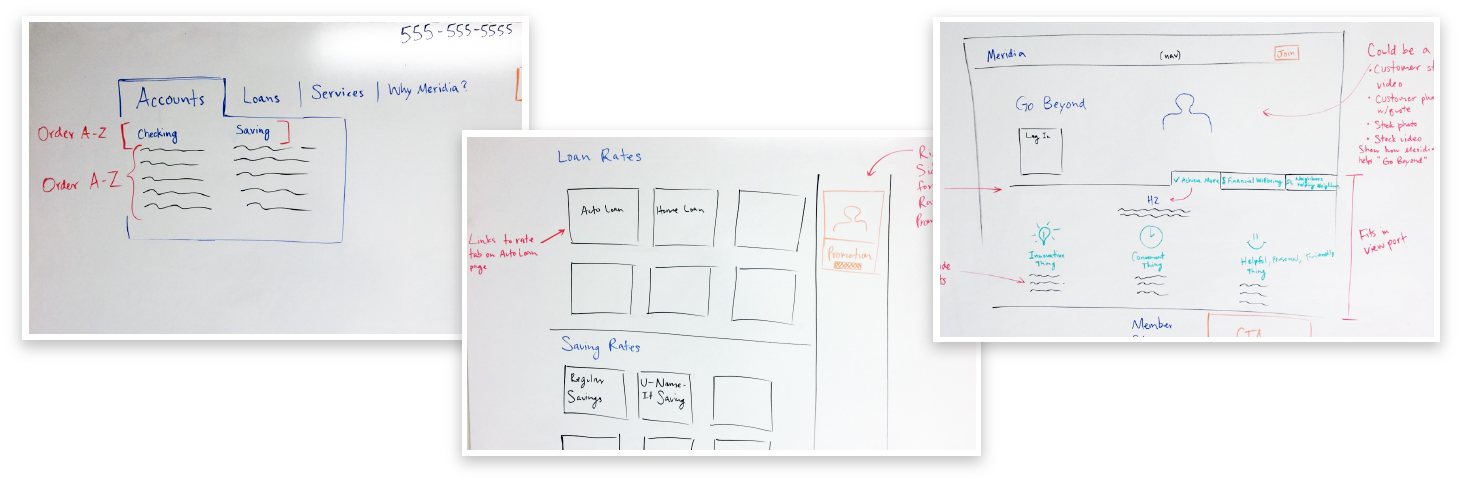
Wireframes
From the whiteboard sketches we designed wireframes in Illustrator. The purpose of the wireframes was to simply depict the layout of each Page Type. We put the wireframes on InVision to encourage collaboration. Discussing the wireframes internally and with Annette revealed how to make her credit union’s website design better.
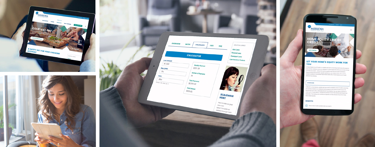
Tabbed content is an important element that was developed during the sketch and wireframe steps. We felt that tabbed content was an elegant way to give users quick access to related information and tools (e.g., Rates and Calculator tabs on the auto loan page).
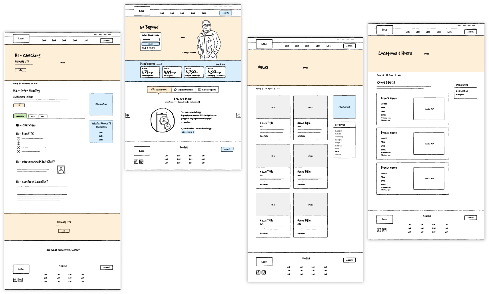
Designs
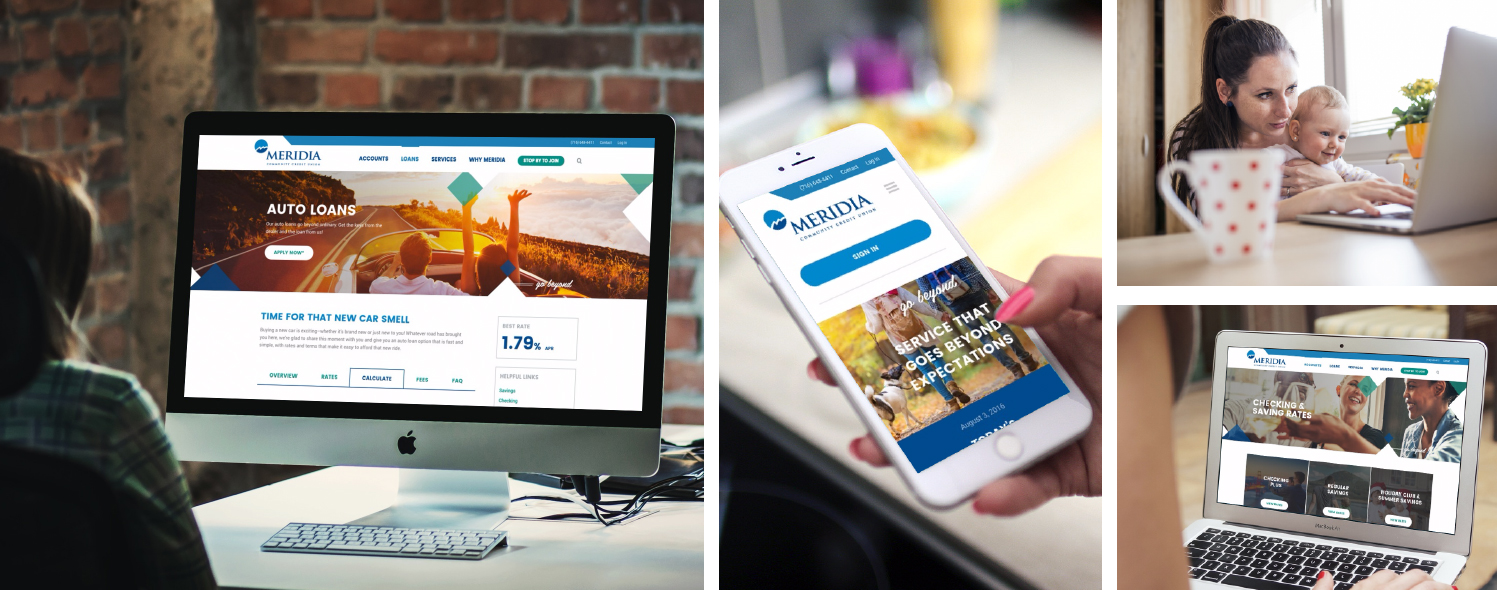
Once everyone felt good about the wireframes, we applied Meridia’s style guide to give the pages colors, images, graphics, and font styles. We shared the page designs with Annette and her team. They liked the designs! But, we still had work to do. We went through several iterations to ensure that Meridia more than “liked” their new website design; we wanted them to LOVE it! We wanted them to feel they were getting one of the world’s best credit union websites!
One change we made was to fill in some of the white space of our first draft. While white space can be good, our first designs had more white than we wanted. In our next iteration, we filled in some of the white space with images and graphics. Over the course of several iterations like this one we designed a website Meridia loves.
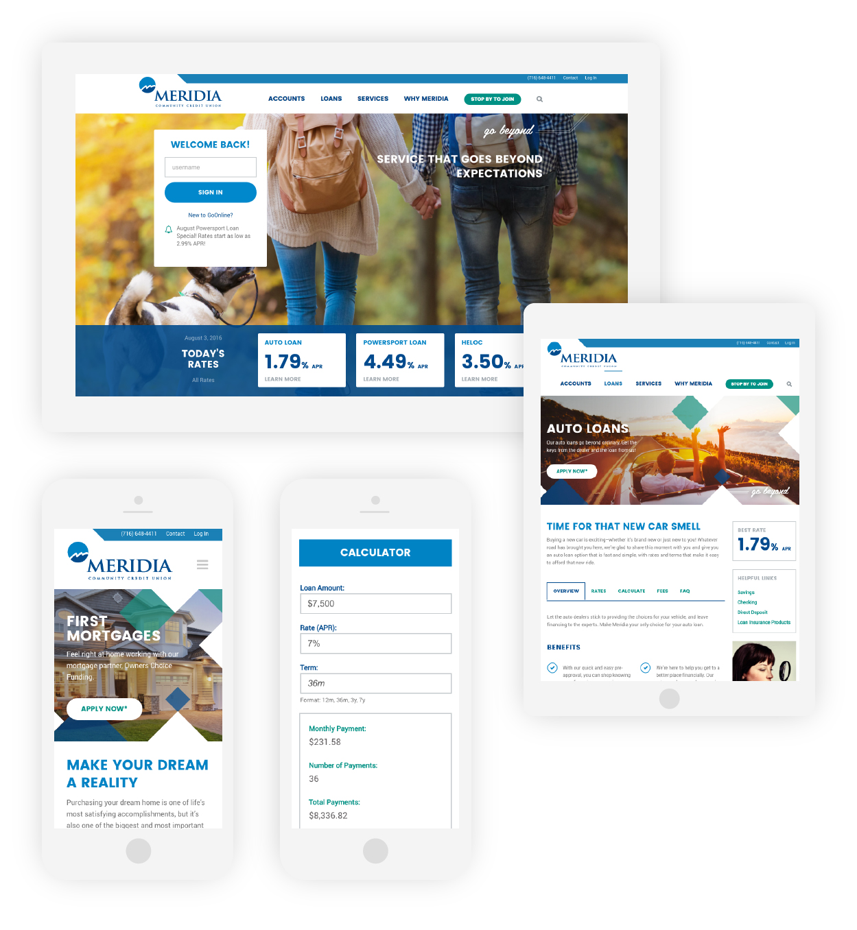
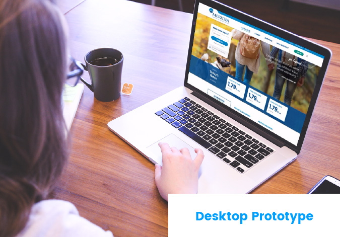
Prototype
Once we designed all the page types and navigation elements, we used InVision to hyperlink the designs and create a clickable prototype. The prototype showed how the final website would look and function after launch, which gave everyone a lot of confidence in our designs.
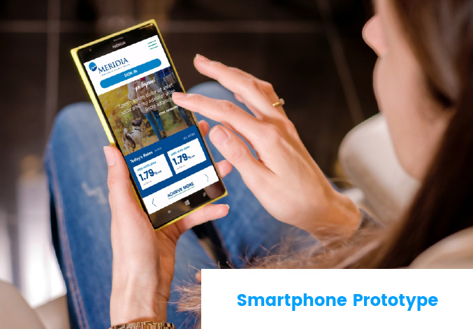
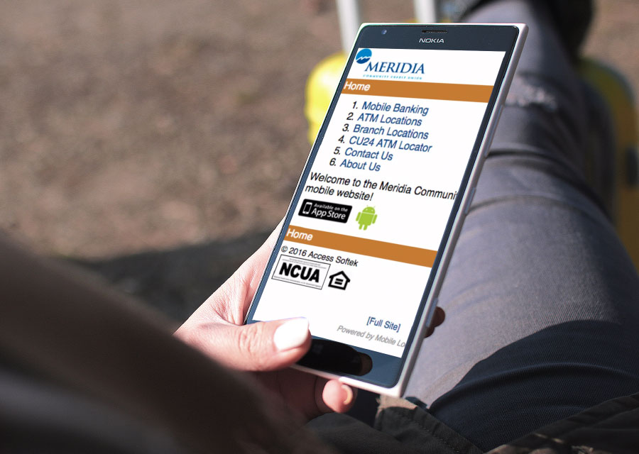
We Designed it for Mobile, Too
All the designs we’d done for Meridia up to this point were for the desktop version of the website. Next, we went through the same design steps to create the website’s mobile version. Again, Annette and Meridia were delighted with the results 🙂
Principle 4:
You Gotta Have Design Skills
Without design skills, we could have followed all three principles above and still got an ugly website. Design skills were the final puzzle piece to Meridia getting one of the best credit union websites. They needed a designer with an eye for beautiful credit union website design who knows how to push buttons in Illustrator. Fortunately for Meridia, BloomCU has mad design skills and we specialize in credit union websites.
The Finish Line: A Beautiful Credit Union Website
“It can’t get any better than what you have done! The whole experience was very organized and educational. I didn’t feel like I was swept through a process, but like I was integrated into the process.”
–Annette Olday, Meridia Community Credit Union
Want more insights?
Get our crazy ideas and doable tips in your inbox.
[ninja_forms id=23]