Some credit unions have product comparison pages, which help website visitors learn the difference between a group of similar, yet, functionally different products. When done right, these pages can be a big help in moving users towards making a decision and opening an account or loan.
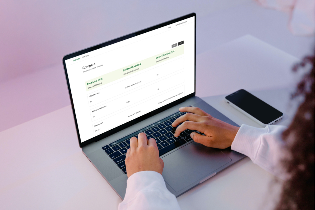
A vital part of designing a comparison page (or really any page) is to make sure it’s easy to use, which you can test through usability testing. We recently designed a comparison page prototype and ran a usability test to see how easy it would be for users to choose a checking account. We’re sharing the results because we’ve found some patterns that work.
In our usability study, participants were given these tasks:
- Pretend you are opening a new checking account and you must choose one of the following options. Which one would you choose and why?
- Explain briefly, why did you choose that checking account instead of another?
Below, we share the results for each task.
Task: Pretend you are opening a new checking account and you must choose one of the following options. Which one would you choose and why?
100% of the study participants completed this task in an average of 14 seconds. Given the amount of information to compare for each account, we believe this is fast.
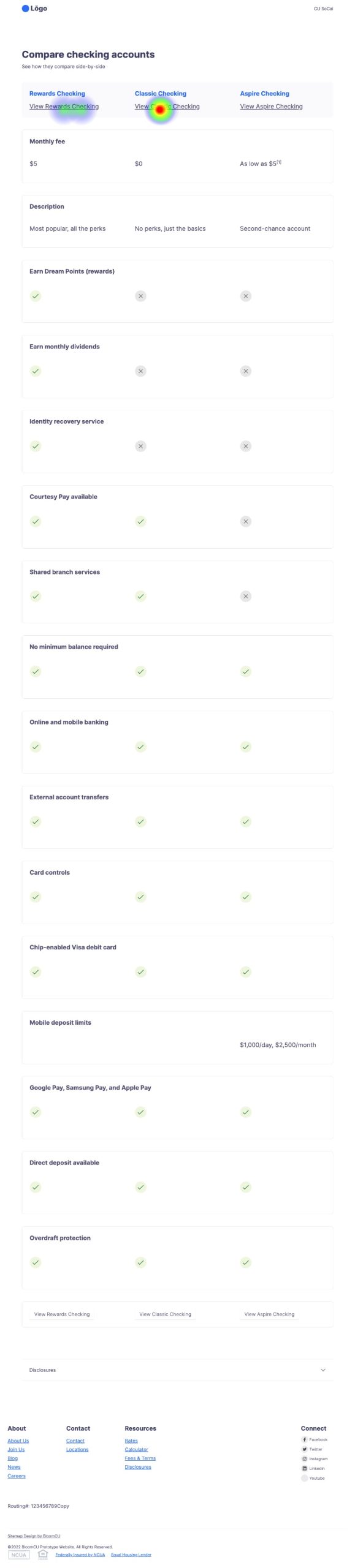
Task: Explain briefly, why did you choose that checking account instead of another?
We asked this open ended question in order to test whether or not participants could easily recall the features or benefits that helped them make the decision.
Below are the real responses to this question:
- “Looked like there would be more benefits in it than the other two.”
- “I wanted the one with no monthly fee.”
- “I liked the perks of this checking account and it was something that I immediately noticed”
- “I went for a free no fee type account because why wouldn’t I”
- “Because I don’t want to pay a fee and I doubt I would earn enough rewards to justify the $5 fee.”
Takeaways
From this usability test, we learned that this page layout is a good model for comparing products because people were able to easily compare options and make a selection.