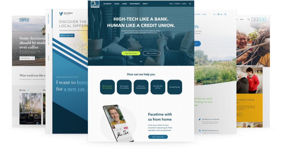
Usability studies with four credit unions
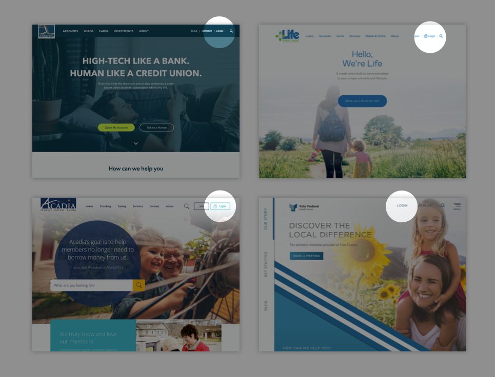
We ran usability studies with four different credit union website designs to see how easily people can access online banking when a login button is placed in the top-right of a website’s navigation.
The goal
The credit unions that participated in this study wanted to know if placing the login button in the top-right of their websites would make it easy for users to access online banking.
The hypothesis
At BloomCU we often employ Laws of Design in our work. Among those laws, Jakob’s Law is one that is relevant to this study. Jakob’s Law states, “Users spend most of their time on other sites. This means that users prefer your site to work the same way as all the other sites they already know.” For example, the top four most-visited websites in the world—Google, YouTube, Facebook, and X (formerly Twitter)—all place their log in buttons in the top-right corners of their sites.
Based on Jakob’s Law, we believed that placing the log in button in the top-right corner of a credit union website would feel natural for users.
The usability tests

We ran usability studies with four credit union website designs to see how easily people could access online banking when the login button is placed in the top-right of a navigation bar. These studies involved a total of 20 study participants. In the experiment, we asked users to log in to online banking. We measured how quickly and easily they could locate the login button.
The results
100% of the study participants were able to find the login button within 1-2 seconds, which is very fast for any task. All participants described the task as being easy to complete. Two of the designs in our experiment used a lock icon on the button. Two users described the lock button as being slightly confusing.
The takeaways
From this usability testing, we learn three big takeaways:
- The top-right of your navigation bar is the highly usable place to put your login button.
- A lock icon on your log in button could confuse users.
- Usability testing can help you learn if a design is usable or not. As they say, “Don’t guess, test.”
