Case study with Denver Community Credit Union
This experiment shows that you can get more applications by emphasizing the information your users care about most.
The goal
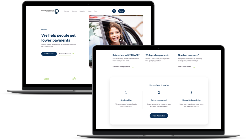
Denver Community Credit Union wanted to increase the number of auto loan applications they get.
The hypothesis
We looked at the auto loan funnel and found that the best opportunity was to improve the click-through rate on the auto loan page itself. Heatmaps showed us that specific elements on the page got more engagement than others, such as the rates, calculator and frequently asked questions. Our hypothesis was that eliminating elements with less engagement and rearranging more popular content toward the top of the page would yield more applications.
The a/b test

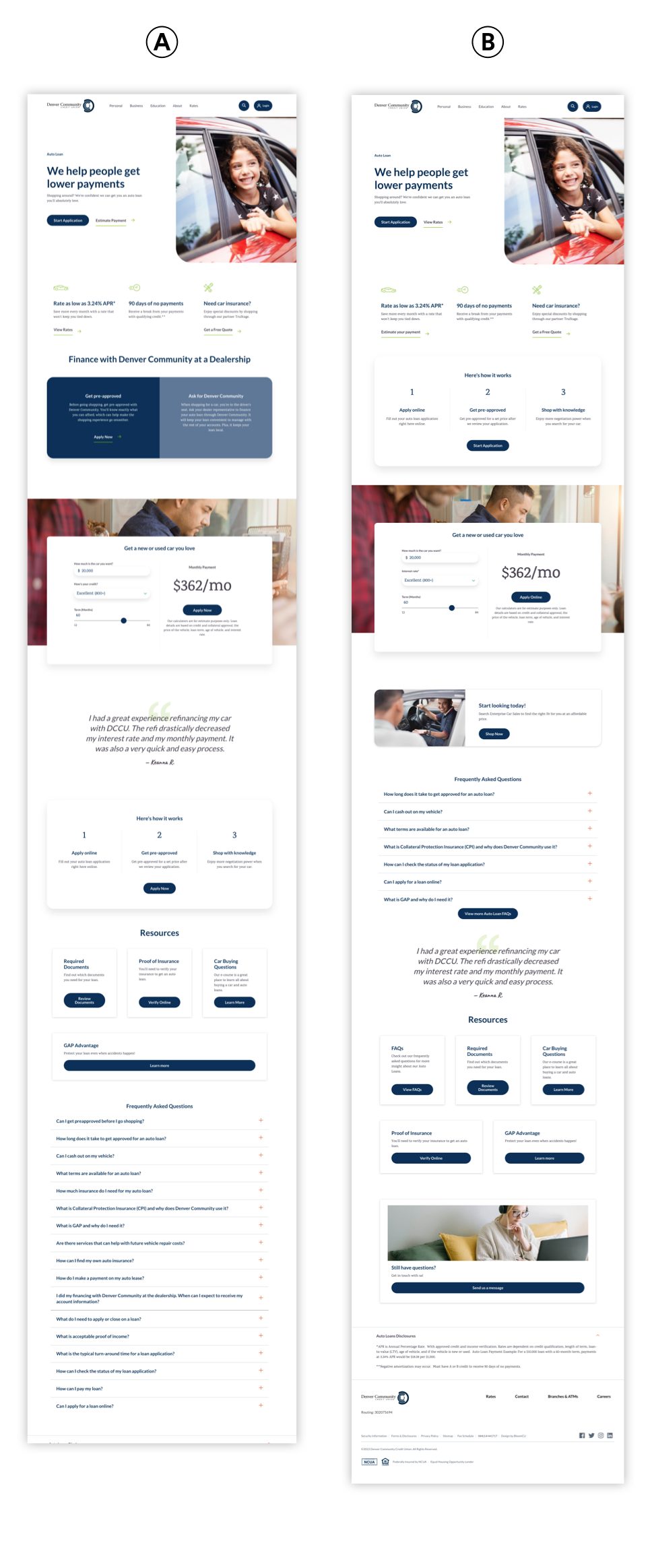
We ran an a/b test to see how our changes to the layout would impact applications. In the control, we left the contents of the auto loan page as-is. In the experiment, we added a link to “View rates” at the top of the page (next to the primary call to action). We also brought the “Here’s how it works” and “Frequently asked questions” sections higher up on the page. Then, we reduced the number of frequently asked questions to showcase only the most popular. We also removed the information about getting financed at a dealership. Finally, we added repeated calls to action in the middle and at the end of the page.
The results
Let’s compare the results of the control vs the experiment.

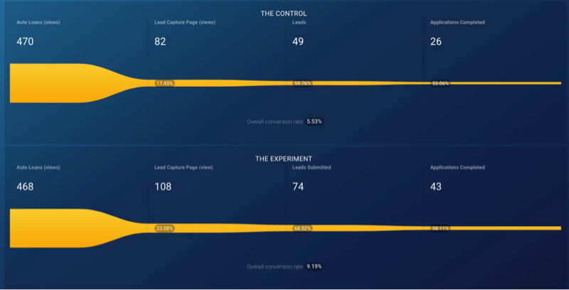
The control version (i.e., what Denver Community started with) got an overall conversion (i.e., amount of completed applications) of 5.53% and the experiment got 9.19% (that’s +66% higher).
Note: These results scored 95.36% statistical confidence.
The takeaway
From this a/b test, we learned that prioritizing the information people engage with (and removing info they don’t engage with) can lead to much higher conversion rates.
