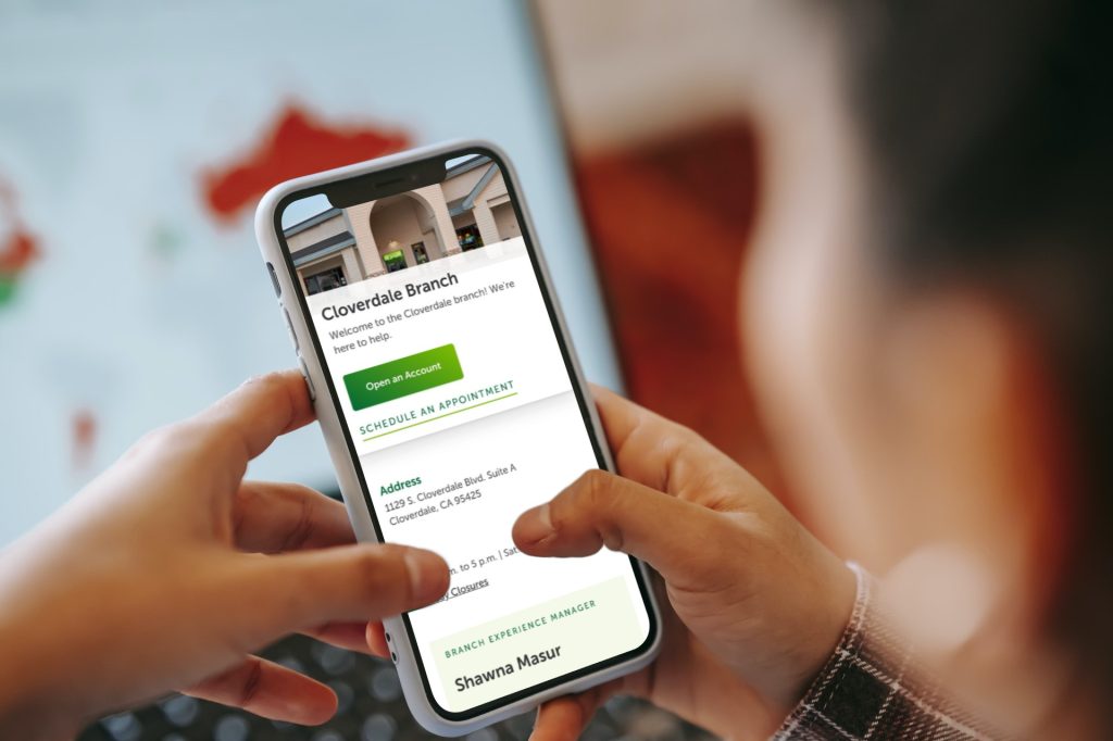
Some credit unions have pages for their individual branch locations, which help website visitors learn what your branches offer. Plus, when optimized for local SEO, they can show up in local searches and bring people to your site.
A vital part of designing a branch page (or really any page) is to make sure it’s easy to use, which you can test through usability testing. We recently designed a branch page prototype and ran a usability test to see how easy it would be for users to find key branch information. We’re sharing the results because we’ve found some patterns that work.
In our usability study, participants were given these tasks:
- Get driving directions
- Find branch hours
- Find out when the branch is closed
- Schedule an appointment for next week
Below, we share the results for each task.
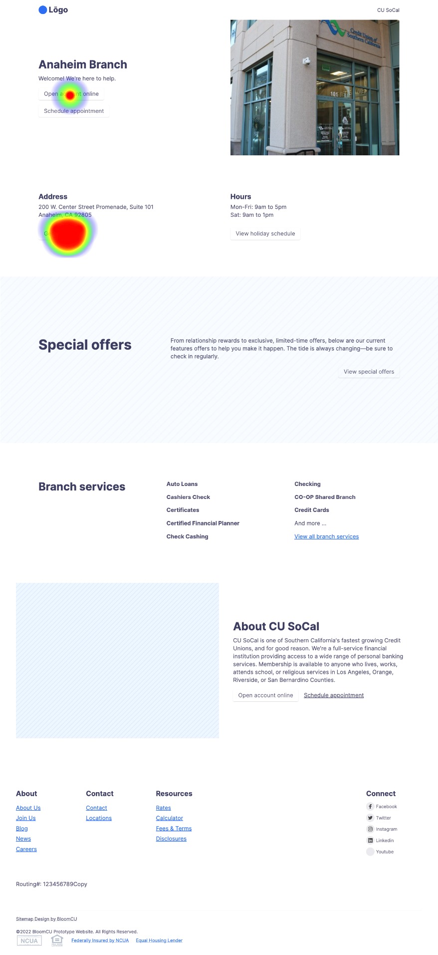
Task: Get driving directions
100% of the study participants completed this task via the expected path. One participant initially misclicked the “Open account online” button but succeeded soon after.
Task: Find branch hours
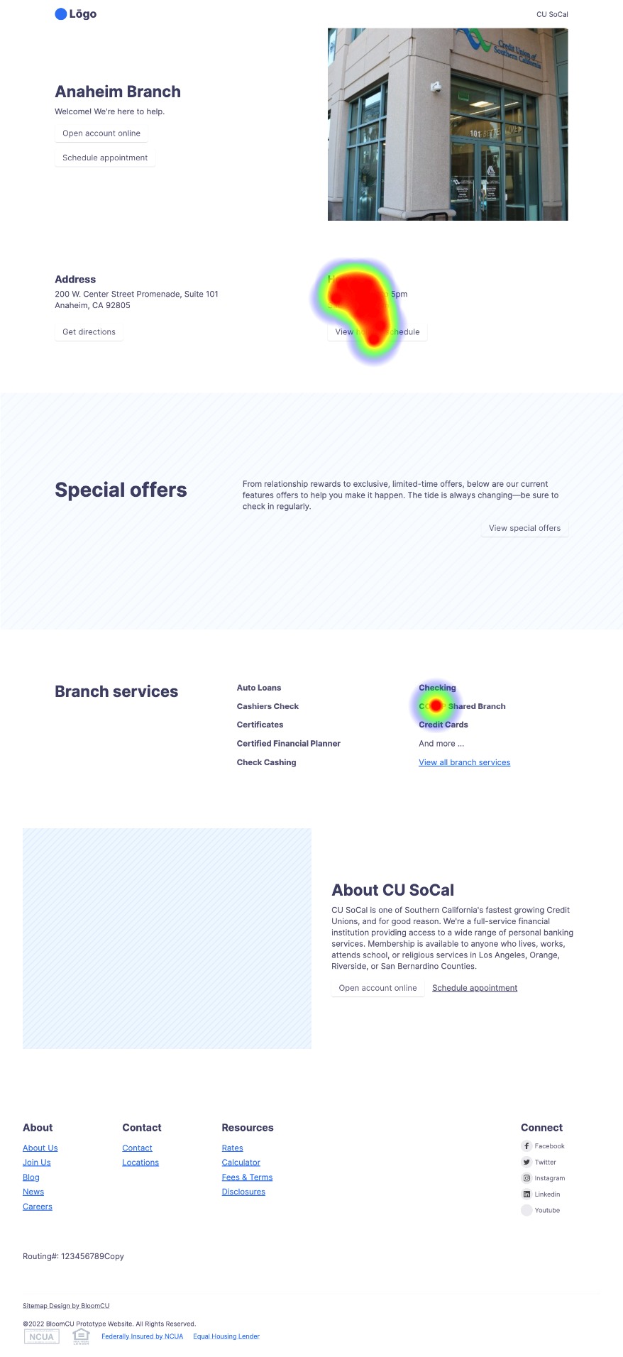
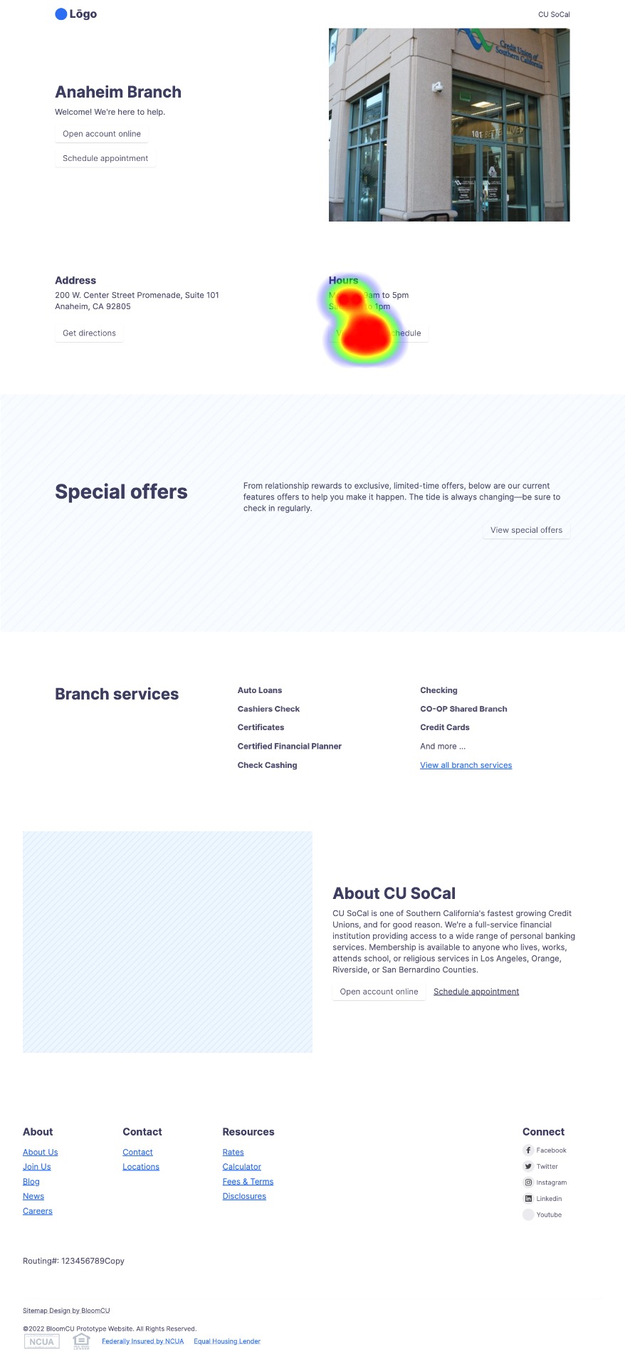
On the heatmap image below, you can see from the big red heat spot that testers easily found the “Hours” info.
Task: Find out when the branch is closed
In the prototype, there is a button below hours that says, “View holiday schedule”. You can see from the heat spot that testers easily found the branch closure information.
Task: Schedule an appointment for next week
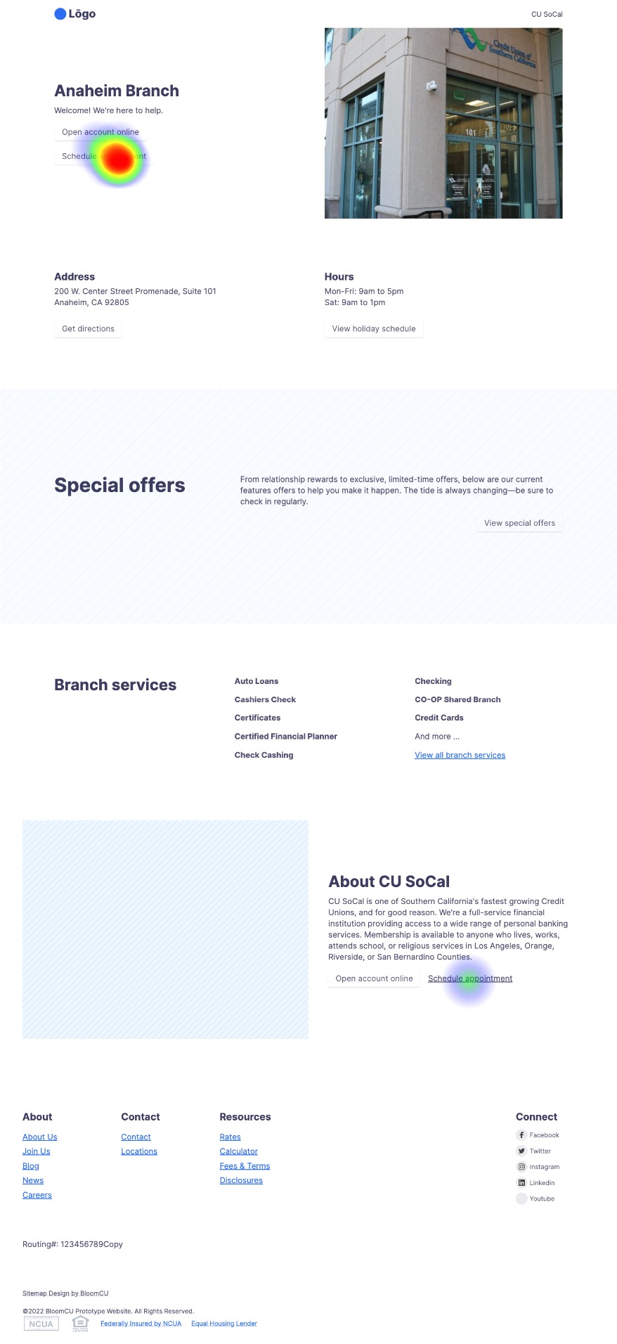
100% of testers completed this task by clicking “Schedule appointment”. Most clicked the button at the top of the page, but one clicked it at the bottom. (To get more people to take action, you should always introduce your call to action at the top of a page and then repeat it at the bottom.)
Takeaways
From this usability test, we learn two big takeaways:
- This prototype is a good model for branch pages because people can easily find important information.
- Usability testing can help you learn the truth about a page. As they say, “Don’t guess, test.”

