If your credit union is like most, then “Contact Us” is one of the most popular pages on your website. As such, it’s important to understand what things people are looking for and how to make them easy to find. We pulled data from our clients’ analytics and found that the following five things are what people click on most when visiting a contact page.
Top 5 things people click most on contact pages
- Main phone number
- Live chat
- Contact form (send a message)
- Find a location (branches & ATMs)
- Schedule appointment
If you only had to consider this list, then designing a contact page might be really easy. But what makes it a little harder is that you have to balance what visitors want with the operations of your credit union. For example, if a member forgets your routing number, they may want to call and ask for it, but having to answer that question over the phone isn’t the best use of time for your call center reps.
Contact page usability test
Considering both the wants of users and credit unions’ operations, we designed a contact page prototype and ran a usability test on it. Usability test results help us make sure that people can easily find what they are looking for.
In our usability study, participants were given these tasks:
- Call us
- Start an online chat
- Use our contact form to message us
- Get directions to the office location nearest you
- Make an appointment
- Copy our ABA/routing number
- Report a stolen debit card
See our test results below. We’ve found some successful patterns and as well as an opportunity for further testing.
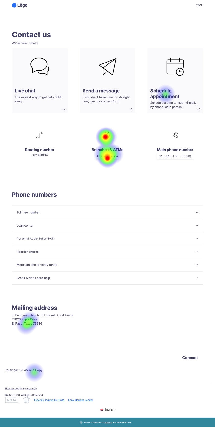
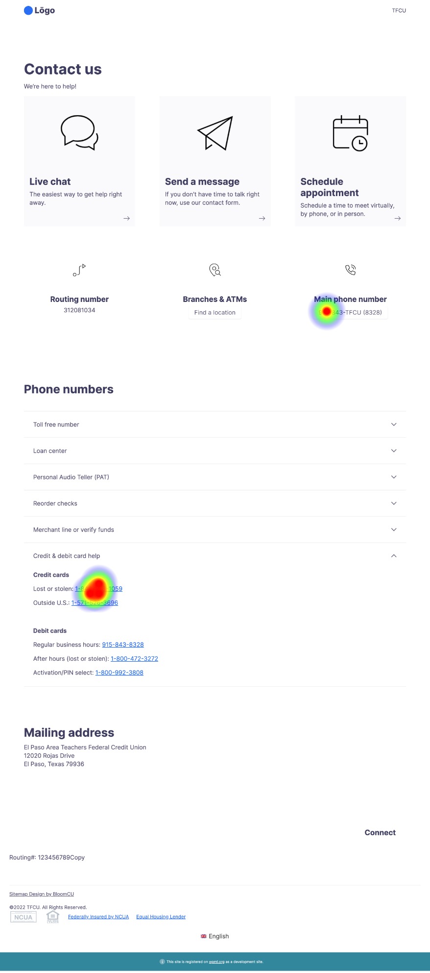
Task 1: Call us
You can see from the heatmap below that when given the task to “Call us”, people can easily find the main phone number in our prototype. (One person clicked “Schedule appointment”, but that appears to be an outlier, so we don’t find it worrisome.)
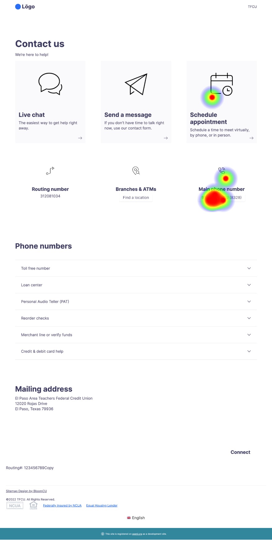
As shown on the Top 5 list above, the most popular thing people click on a contact page is a phone number. Yet, most credit unions don’t want to make their phone numbers the most prominent option because they worry about flooding their call centers. Accordingly, in our prototype, we tried to make the phone number easy to find, but less prominent than other options that are more friendly to credit union operations (like live chat).
Furthermore, most credit unions have lots of different phone numbers. So, we also wanted to make sure that people would find the main phone number in the prototype before finding other, more specific numbers—which they did.
[Back to task list]
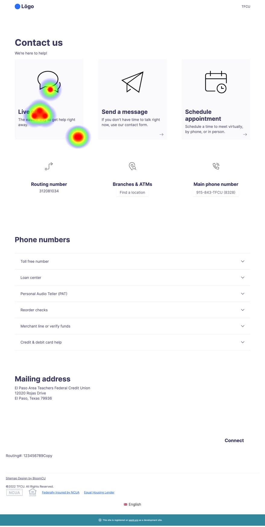
Task 2: Start an online chat
Live chat is popular with website users and friendly to credit union operations, too, so we made it the most prominent option in our prototype. In the usability heatmap below, you can see that all the heat is on the “Live chat” button, which is what we want.
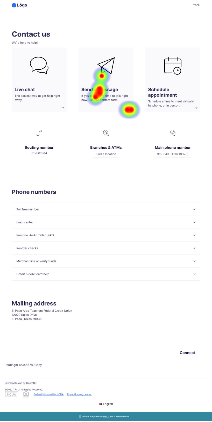
Task 3: Use our contact form to message us
Once again, all the heat is in the right place. People can easily find how to send a message.
Task 4: Get directions to the office location nearest you
Digging into the results for this task, the prototype was actually more successful than the heatmap suggests. It might look like people had a hard time finding the link to branches and ATMs, but actually only one person failed to find it.
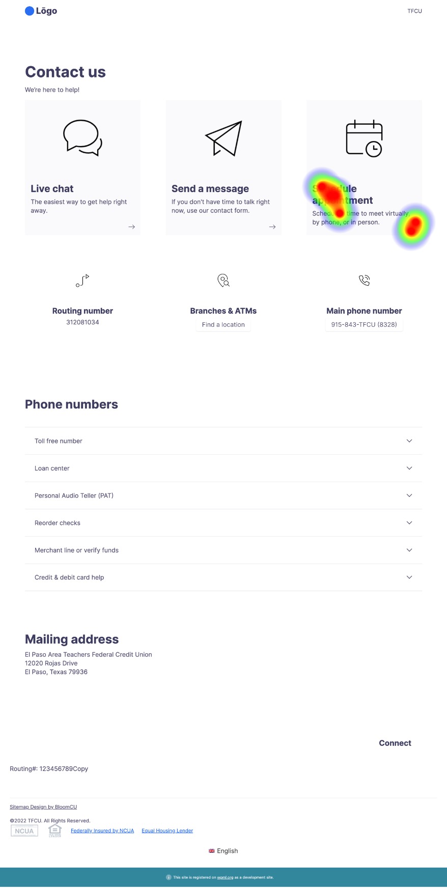
Task 5: Make an appointment
Everyone was able to quickly find how to schedule an appointment.
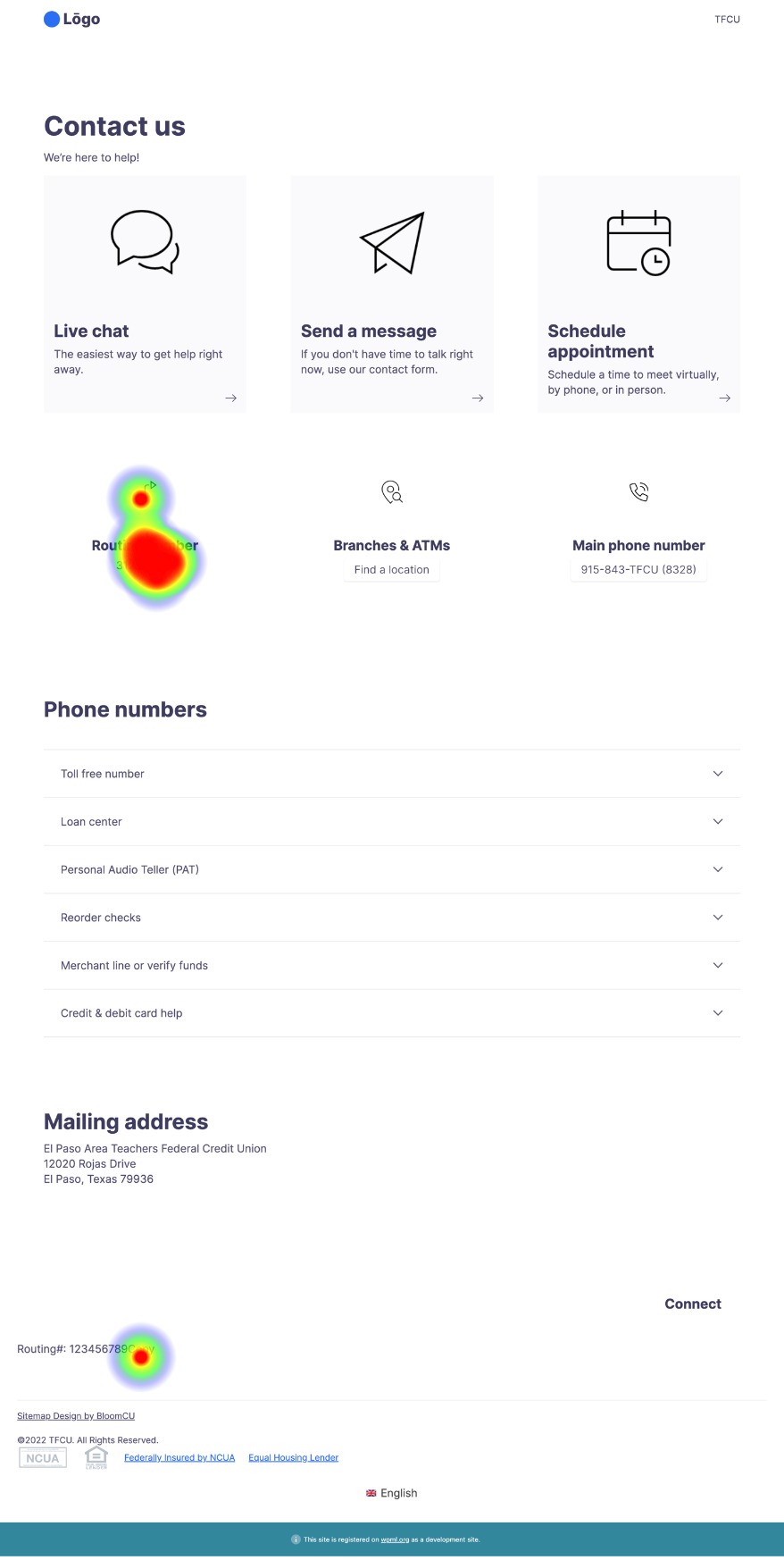
Task 6: Copy our ABA/routing number
We gave the routing number a fairly prominent position in the prototype so members will see it rather than contact you to ask for it. The heatmap shows that users can easily find it; one person even discovered it in the footer.
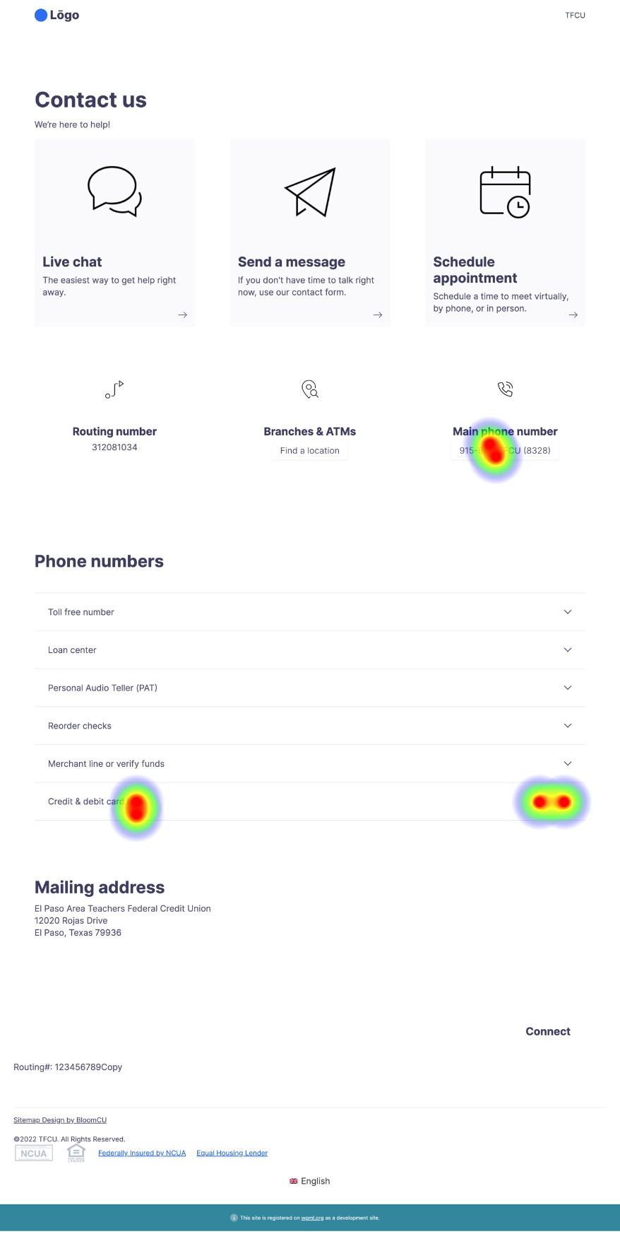
Task 7: Report a stolen debit card
We used this task to test how easily people could find info in the collapsed accordions in the middle of the page. It was a challenging task for users, and it’s the only one in this study that required them to navigate through two different “screens” (see Screen 1 and Screen 2 below). Some people successfully found the section for “Credit & debit card help”, but no one actually selected the correct number of 1-800-472-3272.
If we were to retest this task, we’d try using different labels for the information and perhaps separate the debit and credit card phone numbers into their own sections.
Screen 1
Screen 2
Takeaways
From this usability test, we learn some important takeaways:
- With this prototype, people can easily find the Top 5 things people click most on contact pages. At the same time, it prioritizes operation-friendly contact options (like live chat) over phone calls.
- There is an opportunity to do more testing on Task 7: Report a stolen debit card.
- Usability testing can help you learn what actually works and what doesn’t.