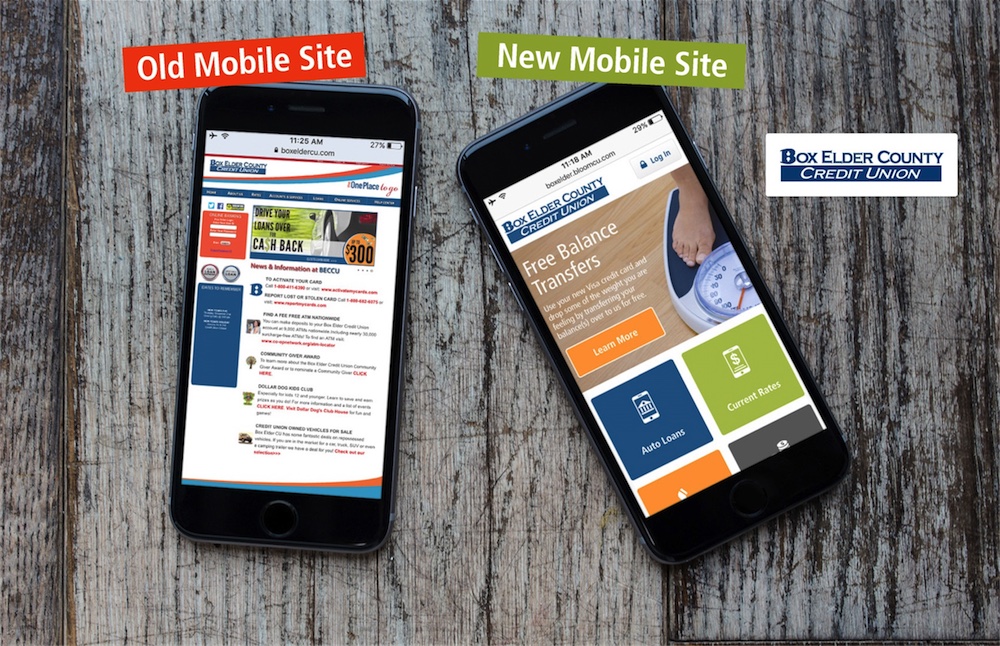
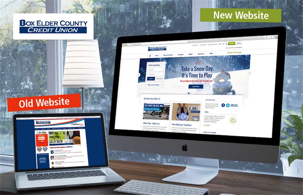
In March 2016, Box Elder County Credit Union won a Diamond Award for a new mobile website designed by BloomCU.
You can see Box Elder’s new mobile site by visiting boxeldercu.com on your smartphone. To see the new desktop site, visit on your desktop, laptop, or tablet. Tonya Gail, Box Elder’s Marketing Director, headed up the website redesign for her credit union. Congratulations to Tonya and the Box Elder gang for this achievement!
We’re proud of the work we did to redesign both the mobile and desktop versions of boxeldercu.com. Tonya Gail said of her experience working with BloomCU, “I’m very happy with our new website! You [BloomCU] communicate well and I feel like we’ve been able to freely express ideas back and forth. Your design, organization, planning, and processes have been great.”
Below are some Before and After shots as well as an explanation of what we did to win a prestigious Diamond Award.
Mobile Redesign

Desktop Redesign

How We Won a Diamond Award
To win a Diamond Award, you have to submit an application and answer questions about your marketing project. Our application responses exemplify BloomCU’s core web design strategy: put yourself in the shoes of the user. That simple, user-focused strategy guides our work and produces award-winning designs.
These application responses are written from the perspective of Box Elder County Credit Union.
Objective & Strategy
“Until December 2015, we didn’t have a mobile website. We knew that in today’s mobile world this was a crime against humanity, so we decided to create a mobile site for our members. We set out with the core strategy to put ourselves in the shoes of mobile visitors. Our objective was to create a useful, simple experience that connects with residents of Box Elder County and makes them feel like Box Elder CU really is ‘The One Place to Go’ for all financial needs. The result of our efforts is an elegant, simple experience for smartphone visitors.”
Creative Concept
“Every aspect of the mobile website was created with residents of Box Elder County (our target audience) in mind, right down to nitty gritty details about what types of houses and cars to show in our images. We did this because we really want to connect with our visitors and show that we understand who they are, because they are our friends and neighbors in Box Elder County.
“We understand that becoming a member of a credit union or taking out a loan are not just single events, but culminations of journeys. Accordingly, the mobile website was designed to successfully guide visitors on their journeys, nurturing them with what they need at the time. We spent significant time making the mobile website easy to navigate on mobile devices and considered the customer buying process to decide what calls to action are appropriate for each page.”
Communication Strategy
“For a mobile website, relevance and simplicity are paramount. Most people visiting a credit union website with a mobile device do so for only a handful of purposes. For that reason, we simplified the mobile site to include only the most needed pages. Doing this created a clean, elegant experience for mobile visitors. (If needed, we can simply add more pages to the mobile site.)
“Product and services featured on the mobile site are explained using psychological principles of communication that optimize the chances of persuading action. While not all mobile pages contain all of these communication elements (for the sake of brevity on the mobile site), you will find these elements used on mobile pages:
- “A brief introduction to the product or service that explains Who and What.
- “A summary of benefits people get from using this product or service. This tells readers why they should care. (Benefits are not features or advantages. Benefits are things that relate to Maslow’s Hierarchy of Needs.)
- “Additional information that educates the reader about the product or service.
- “One or more calls to action appropriate for the visitors’ stage in the journey to conversion.”
Learn How to Get a Beautiful Credit Union Website Design
To learn more about the process of creating a gorgeous credit union website design, see this case study with Meridia Community Credit Union: How Meridia Got a Beautiful Credit Union Website Design.
Want more insights?
Get our crazy ideas and doable tips in your inbox.

