I vividly remember the first and only time I met a hoarder. I’m not talking about the garden-variety hoarder like me who saves all the sauces I get from fast food restaurants because I never know when I’ll need some Chic-fil-A Sauce. Nor am I talking about a hoarder like my wife who has a hard time letting go of a shirt she hasn’t worn for two years because she might want to wear it “someday.” No, I’m talking about a real hoarder—the kind worthy of the TV series on A&E.
When I was 19, I went on a church trip to New Zealand. In an area called Mt. Roskill, a friend and I were introduced to a woman who needed help around her house. When we arrived at her house to help clean up, we were astonished by the scene.
The front lawn of her house was one giant pile of junk. I could hardly see the grass. The inside of her two-story house was no different than the front yard. In every room of the house were piles of stuff stacked as high as my shoulders. The junk piles consisted of articles of of every kind. I have a hard time recollecting the great variety of clutter I saw, though I remember lots of clothing, newspapers, phone books, and countless black garbage bags stuffed full of junk.
In the midst of the endless piles were narrow pathways that allowed passage through the house. The pathways were as grand canyons cut through walls of junk with river beds of dirty carpet. She led us from the front door, up some stairs, through the kitchen, and into the backyard where she wanted help starting the insurmountable task of cleaning up.
After a few hours of cleaning that made no noticeable difference, she thanked us for coming and we said goodbye. I left in awe. “She can’t throw away the junk because she fears losing something valuable,” her friend explained to me.
Some credit union marketers suffer from the same hoarding mentality.
Above the Fold
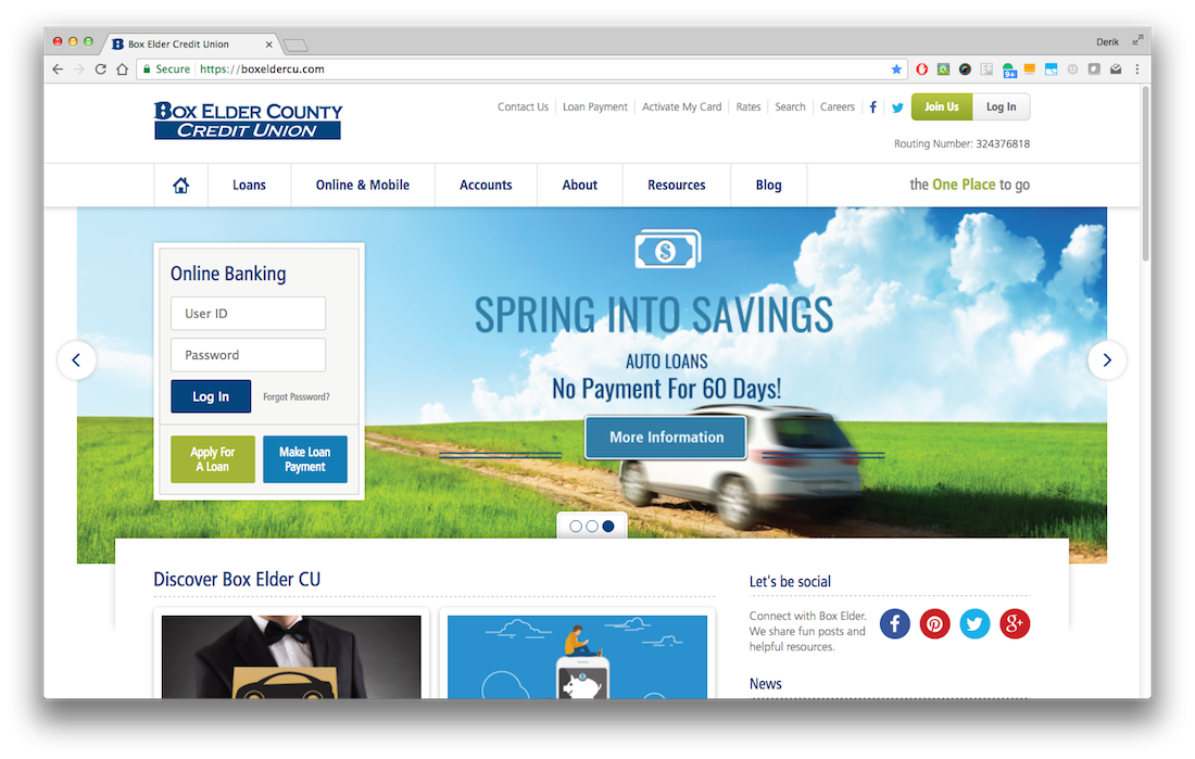
There’s a common myth that website users don’t scroll. Consequently, some credit union website designs cram information “above the fold” because marketers believe anything below the fold won’t be seen. (The fold is the bottom of the viewport. Therefore, anything that can be seen when a web page first loads, without scrolling, is “above the fold.” To see you anything below the fold, you have to scroll down the page.)This cramming obsession is what credit union marketers and hoarders have in common: they can’t throw away the junk because they fear losing something valuable.
Unfortunately, stuffing lots of things above the fold has the opposite of the intended effect. With too many things above the fold, users are inundated with more information than they can process (or care to process). Sadly, clutter suffocates your answer to the user’s most important question, “Why should I bank with your credit union?”
Myth vs. Reality
The truth is website visitors do scroll. In fact, research indicates that 66 percent of attention on the average web page is spent below the fold. Further studies have shown that web visitors use the scroll bar on 76 percent of the sites they visit.
The key is to give your visitors ample reason scroll. Thankfully, there are several techniques that entice users to continue reading below the fold. Let’s take a look at several of these tactics.
How to Entice Users to Scroll
Adopt the “less is more” concept
Rule number one in credit union website design is avoiding the temptation to stuff too much information above the fold. The top of your homepage should have only two purposes:
- Tell people who you are and what’s unique about your credit union in 12 words or less (i.e., your brand)
- Help people get what they came for as quickly and easily as possible (i.e., navigation; think mega menus, site search, and chatbots)
Outside of those two purposes, utilize white space and compelling imagery to encourage visitors to explore.
Use visual cues that encourage scrolling
Here are a few visual tricks that have been proven effective:
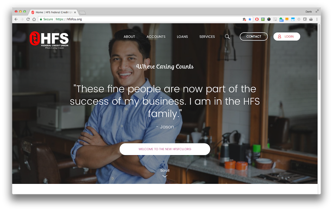
- Have content below the fold just peek up above the fold, indicating there is more to see below. Example:
- Use a graphic, such as an arrow, at the bottom of the viewport above the fold. You can even animate this graphic to make it more eye-catching. Example:
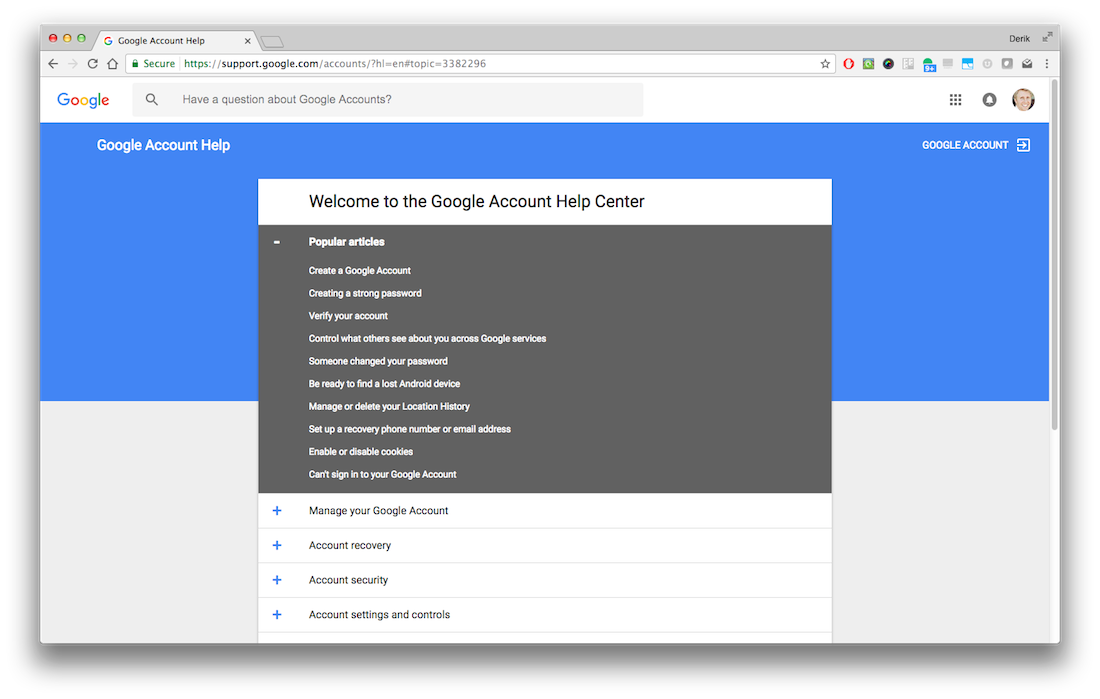
- Use borders to create contrast between the main content and sides of the page. This is a subtle but effective way to let visitors know there is more content below the fold.
Beware of horizontals that create “false bottoms”
Using horizontal bands, lines, or bars on the fold can create the appearance that it’s the end of the page when, in fact, there is more content below.
Use compelling calls to action
Compelling language in the copy above the fold encourages users to learn more and scroll. You could even explicitly use terms like “Scroll down to ….”
Simplify
The real estate at the top of your homepage is very important. That’s why it should be used only for the content that is most important to a credit union website design: branding and navigation. All other content is less important and, therefore, should be placed lower on the homepage or on a subpage.
Simplicity is something we all crave in this complicated world. So, instead of hoarding content above the fold, use the tips and tricks above to encourage scrolling and create a more elegant credit union website design.
Want more insights?
Get our crazy ideas and doable tips in your inbox.


