When it comes to credit union website design, there are a lot of questions. What’s the best way to promote things on the website? How can you make the site ADA compliant? Should you put up pictures of Selena Gomez, in hopes of attracting more millenials?
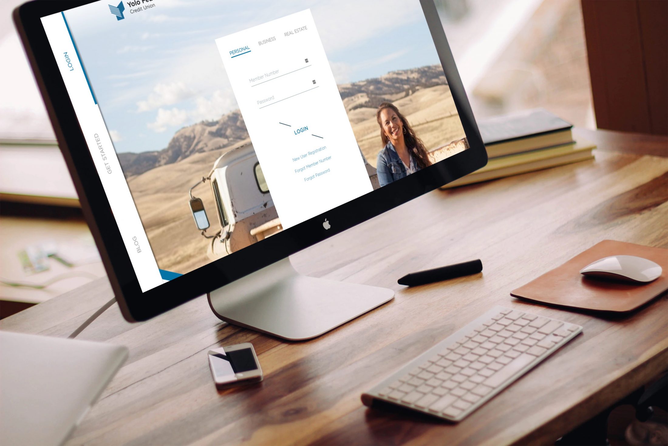
Here’s another one that always stirs debate: “Should you put the online banking login front and center on your homepage? Or, should you hide it behind a login button?” If you’ve ever completed or considered a site redesign, this question probably came up.
A front-and-center login (with name and password fields) provides seamlessly convenience to your regular members, which make up about 60-70% of your website traffic. On the other hand, the login is irrelevant to nonmembers. Attracting new members is important to the growth of your credit union and the full login takes up space you could use to establish your brand, sign up new members, and boost your website’s ROI.
With a traditional approach to credit union website design, you have to pick your poison: you can place the full login straight on your homepage, or not. But with new technology, you can have the best of both worlds.
Thanks to personalization technology, you have the option of showing different versions of your homepage to different people. …
Continue Reading on CUInsight.com