Why do you spend thousands of dollars on credit union website design? Because you want website visitors to become depositors and borrowers. But if you want people to take action, your calls to action (CTAs) have to be persuasive. That’s why we put together this handy list of six tips: so you can improve your CTAs and reap the rewards of a higher conversion rate.
#1 Be concise
CTAs that are wordy are harder to read. And that means people are less likely to click them. According to Statisticbrain.com, the average person’s attention span is only 8 seconds long—and most people only read 28% of words of the words on any given web page. That’s why it’s so important to keep things concise.
Take a look at this bad example from Neil Patel’s popular marketing blog:
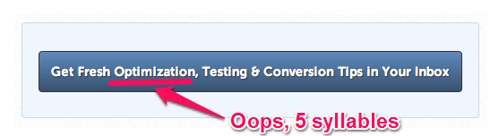
It’s not only ten words long, it also uses a five syllable word. Your eyes naturally glaze over it as you read it.
Much better is this example:

It’s short, powerful, and specific. Plus, it adds a sense of urgency with the word “instant.”
#2 Use an action word
You need to make sure you use an action word. If your CTA doesn’t include a verb (e.g., learn, get, open, try, make, join, etc.) then it’s not really a call to action.
Let’s say you have a button on your website that reads “Brochure”. If users click it, they can download your brochure to learn more about a health savings account. However, by just saying “Brochure”, you aren’t inviting them to do anything. For a much more effective method, try changing the button to read something like “Learn More About HSAs” or “See If You Qualify”.
#3 Repeat your CTA
This is a tactic that’s been proven to be remarkably effective. GoodUI.org shared a study about repeating a CTA at the bottom of a page in addition to showing a CTA at the top. The result? An 84% increase in overall conversions. See if you can find a place on your own website pages where repeating the CTA feels natural and unobtrusive, and then enjoy the rewards.
#4 Be specific
When you make your CTAs too generic, you may lose out on conversions. Specificity gets attention. Fitness World, a well-known chain of gyms in Scandinavia, had a 213.16% increase in conversions when they changed their CTA from “Get Membership” to “Find Your Gym & Get Membership.”
On your credit union website, you could translate this concept to using a CTA like, “Open My Checking Account,” rather than something more bland such as, “Get Started.”
#5 Use power words
As a marketer, you may have heard about using “power words” and avoiding “friction words”. These same principles can be applied to the CTAs on your website. People are psychologically drawn to positive, action-oriented words that create a sense of immediacy. Buffer Social has a great list of power words (alongside advice for using them in your copy) that you can refer to if you’re looking for ideas.
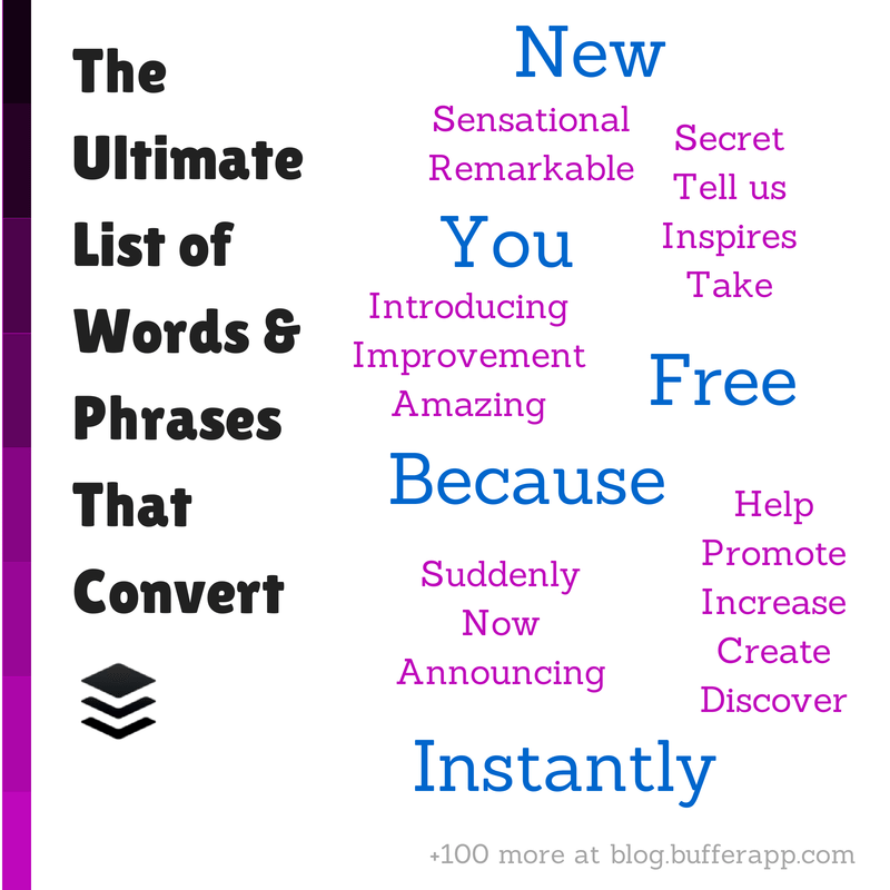
Some of Buffer Social’s power words.
If you find that some power words feel too intense when you put them on a button, don’t forget that you can also use them to lead up to your CTA. Take a look at this screengrab from the credit union website we designed for for KellyCommunity.org:

Note the power words “help” and “you” leading right up to a very specific CTA.
The opposite of power words are “friction words”. Friction words make someone pause and think, “Do I really want this?” Most often, they call to mind commitment. A few specific words to avoid on your credit union website are Buy, Submit, Complete, Order, and Invest.
#6 Use an actual button
Using a button for your CTA draws the eye to it and makes it feel important. Campaign Monitor found that their conversions increased 28% when they used a button for a CTA, rather than just a plain link. If you have time, it’s also a good idea to experiment with the layout and design of your CTA.
Conclusion
Employ these principles, and you’re on your way to more loans and deposits. Having concise, beautifully-written CTAs will persuade your site visitors to start filling out applications. As always, we encourage you to test the changes you make and keep tweaking them for best results.
Want more insights?
Get our crazy ideas and doable tips in your inbox.