A study by the Boston Consulting Group discovered that authenticity is one of the top qualities that attracts consumers to a brand.
Authenticity is deeply important to credit unions. People often turn to credit unions because they are tired of big, inhuman banks that treat them like sheeple (shee·ple, noun: people compared to sheep in being docile, foolish, or easily led.). In truth, many credit unions were formed in the first place to provide an alternative to inauthentic banks.
Today, where do most people first learn about your credit union? Online. That’s why your website is the face if your brand. If you want to show you’re authentic, it starts with your credit union website design. Let’s talk about why authenticity is so important,then look at three specific ways you can show authenticity on your website.
Why authenticity is so valuable
Not only is authenticity its own reward, and an inherent part of your member-owned brand, it’s also highly desirable and appealing to consumers. More and more these days, people are drawn to what they deem to be “authentic” rather than flashy marketing campaigns with all the bells and whistles. A commercial featuring a pricey car and a slickly-dressed model may not get you the mileage you think it will.
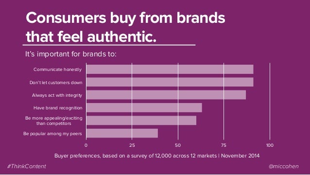
Source: ThinkContent/News Cred
The tendency goes further. Authenticity also generates better word of mouth. Research by consulting agencies Principals and Brand Navigator found a strong correlation between a company’s authenticity and the likelihood that its customers might become brand advocates.
But even if you’re convinced that authenticity is important, how do you show your authenticity on your website? It’s a fairly abstract concept, so we’ll need to translate it into individual elements.
How you can be more authentic
Below are three ways you can make your credit union website design feel more authentic.
#1 Use authentic photos
Just because a photo uses good techniques (e.g., rule of thirds), doesn’t mean it’s authentic. We love a slideshare from News Cred that has a ton of good information on capturing authentic photos. One thing they discuss is the “human element.” Do the pictures you use on your website show real people doing real things? Let’s take a look at one of their examples.
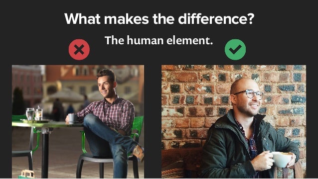
The photo on the left is technically just fine. It uses the rule of thirds, the focus is good, and the subject is clear. However, it also looks artificial. The subject is clearly a professional model, and his pose is stiff and inhuman. In contrast the photo on the right is less posed and polished. The person in the photo seems like somebody you might know in real life, in both his dress and manner. The overall subject matter is the same—a man holding coffee—but the one on the right feels more authentic.
Having a human element in your photos is helpful even if you are not using a human subject, as this second comparison from News Cred shows.
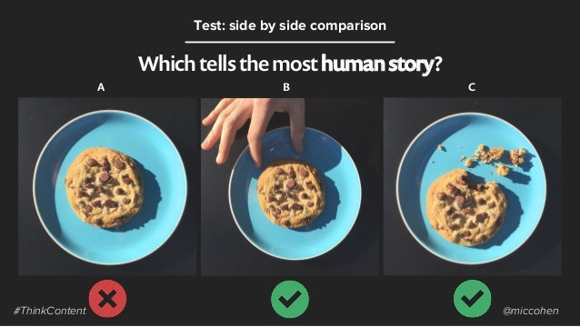
The two images on the right feel less perfect, but more compelling and relatable. We don’t just see a cookie when we look at these pictures, we can picture ourselves eating this cookie.
#2 Use authentic language
Does the language on your website sound authentic? If someone came into one of your branches, how would your member service representatives speak to them? They would probably be friendly, personable, and genuine. You can aim for that exact same kind of tone in your writing. When you add copy to your credit union website, try reading every word out loud. Then ask yourself, is this something a real person would say? If it’s overly robotic or sounds insincere, do a rewrite.
Consider this example:
Our auto loan deals will change your life! Apply now if you really want one, but you have to act fast, or the deal is gone!
This is way too salesy and has a false sense of urgency. It seems more like a midnight infomercial than a credit union who has their members’ best interests at heart.
On the other side of the spectrum, we have this:
Acme credit union is the premiere credit union for the discriminating and money-minded individual. Deals offered by Acme are relatively easy to obtain, provided your credit passes our rigorous inspection and application process.
See what’s wrong with this one? It’s way too wordy and language heavy. It doesn’t sound like anything a real person would write, much less say out loud.
As a third option, consider this, from our recent client, United Texas’s checking account page:
Not sure which account is right for you? We break down the basic types of accounts right here so you can make an informed choice.
Notice that the tone is casual and friendly, but still professional. It focuses on educating the user, not just selling to them.
#3 Show proof
It’s essential that you help site visitors understand all that your credit union can do for them and do it in a way that is honest and specific.
When you make a claim, back it up with facts. Don’t just say you have stellar rates, have a rates sheet or some other way of showing them. If your rates aren’t amazing on a particular loan or account, don’t say they are. Instead, focus on your strengths—people care about more than just rates..
If you emphasize your credit union’s actual strengths, you’ll come across as much more authentic. And that authenticity will win you more members who stay loyal their whole lives.
Want more insights?
Get our crazy ideas and doable tips in your inbox.