
Calls to action (CTAs) are prime real estate when it comes to your credit union website. In fact, more than 90% of visitors who read your headline also read your CTA copy—with that many potential eyes, it’s crucial that you write compelling CTAs that inspire action.
Your CTA is an invitation for your customers to take a certain action, whether it be to sign up, subscribe, start a trial, learn more, etc. The more carefully you craft it, the more likely people are to act in the way you’d like them to. Check out these tips for writing strong CTAs that convert.
1. Start off with a strong verb
Use action verbs that make it clear what the desired action is right off the bat. For example, instead of “Our ebook is available now,” rework the statement to inspire action, such as “Download our ebook today.” This CTA on HSHFCU’s website is a good example since it leads with a powerful verb, “discover.” Remember that even small copy changes can have a big impact on your conversion rate.

2. Inspire enthusiasm
Even though it’s short, your CTA can still strike an inspirational tone. For example, swap “Come to our open house” with “Come find your dream home.” The call to action is the same, but the tone is completely different.
3. Remember FOMO is a real thing
Write a CTA that conveys urgency or scarcity to encourage people to act promptly. Offer special discounts for a limited time, create a countdown timer, or show how many other people have already taken action.
4. Get personal
According to Unbounce, changing the text on a button from “you” to “me” increased conversions by 90%. Customers don’t like feeling as if they are just one of the masses—they want to feel known as an individual. Using “I” and “me” helps customers imagine themselves taking action.
5. Show value
A well-written CTA clearly conveys the benefits people will get when they act. For example, on ConversionXL’s website, they replace “Download Now” with “Become a conversion master” as their CTA, clearly focusing on the benefit. This CTA on HSHFCU’s website promises a benefit that rings true for nearly everyone, rather than just asking people to “Apply now.”

You can also take advantage of real estate around the actual CTA to convey value. For example, on People Driven CU’s website, they describe the value shortly and succinctly in the text before the actual CTA button.

6. Make it stand out
Use white space and contrasting colors. Make it big enough to be legible but not obnoxious. This CTA on PennEastFCU.org uses dark color and plenty of white space.

7. Place it strategically
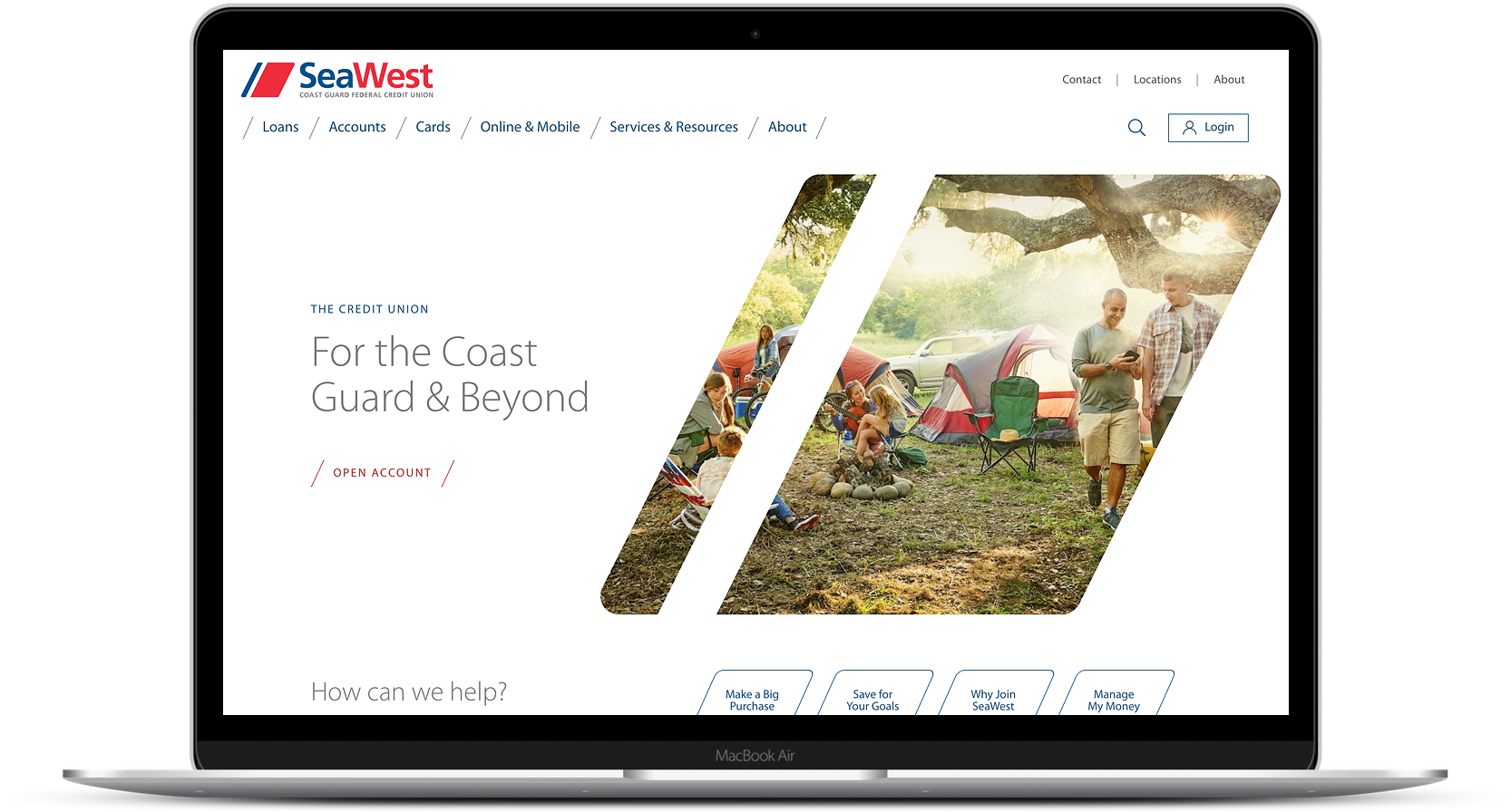
The location of your CTA depends on where someone is in the decision-making process. If they are further down the funnel, you can put the CTA near the top of the page so it catches their attention right away. Put it at the end of the page if they need to digest more information first, and place it in the middle if it relates to other content. You can use a pop-up CTA, but make sure it appears after the customer has been viewing the page for an amount of time that indicates interest. You can also place your CTA in the sidebar or navigation bar. For example, on this website designed for SeaWest.coop, you have a clear CTA at the top of the page above the fold so that the visitor can take action right away.
8. Avoid technical jargon
Don’t use words that could confuse the customer. Write so the reader can clearly understand and relate to you, regardless of their level of industry or technical knowledge.
9. Iterate, iterate, iterate
Performable saw a 21% increase on conversions by changing the color of the CTA button, and SiteBuilderReport saw a 13.4% after removing one word from the CTA. So don’t just throw your CTA into the wild and hope it survives. Gather data on how the CTA is performing and experiment with copy, color, size, placement, text, etc. Little tweaks can go a long way, but make sure you test one factor at a time to determine which makes a difference.
Your CTA may be a small thing on your website, but it can pack a big punch when it comes to your conversion rate. If you take the time to compose them carefully and test them frequently, your CTAs can help you grow your credit union, one simple button at a time.
For more tips on optimizing your CTAs, check out this blog.