
Ten seconds—it’s the amount of time it takes you to tie your shoes, send a text, or, if you’re Usain Bolt, run 100m. Unfortunately, it’s also how long you have to capture the attention of a visitor to your credit union website before they lose interest (with maybe 5-10 seconds to spare if they’re feeling particularly generous).
In other words, there’s absolutely no time to waste. Visitors to your credit union website have a mission, and they have a lot of other sources vying for their attention—you need to help them find what they are looking for quickly and easily if you want them to pick you. In order to do so, it’s best to forget the bells and whistles and keep your website content short and simple.
Here are some easy tips to keep in mind as you’re writing content for your credit union website so you can best serve your visitors and hopefully gain new members.
Make it scannable
People don’t read websites—they scan them. Studies show that only 16% of people actually read web pages word for word. With a stat like that, it’s best to give the people what they want and enable their inevitable scanning habits. Try and pay attention to the following as you write:
- Use short, powerful, and direct subheads. The purpose of the subheads is to tell the reader what they need to know at a glance, not to try and be clever. Research shows that 80% of blog readers pause their scrolling to read headlines, while only 20% actually read the rest of the article—which means headlines are shots you can’t afford to miss.
- Capitalize on the power of bullets. Bullets are a scanner’s best friend and are an easy way to break up text. If you’re using commas, consider using bullets instead.
- Use paragraphs generously. Chop up the page with short paragraphs that are easy to digest.
- Think visually. Humans like pictures. 90% of information transmitted to the brain is visual, and visuals are processed 60,000 times faster than text. So try to incorporate purposeful images to give readers a break from the text and catch their eye. Appropriate use of whitespace can also help here.
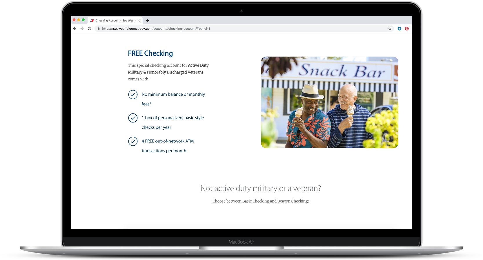
This webpage designed for SeaWest.coop makes use of bullets, visuals, whitespace, and a clear headline to make it easily scannable and consumable.
Always keep readability in mind
According to webpagefx.com, the average American adult reads at a 7th to 9th-grade level. So in order to appeal to the broadest audience possible, you should try to keep website content at a middle school reading level or lower. You can use free tools to determine the Flesch-Kincaid Reading Ease score of your website. Here are some ideas for making content easy to read:
- Use simpler word choices and avoid jargon. Spell out acronyms, avoid insider language or buzzwords, and explain complex terms (hyperlinking to external content if necessary).
- Keep your sentences short—shoot for 35 words or fewer.
- Use active voice to make your sentences less complex and more succinct.
- Have a conversation with the reader. Try to minimize the distance between you and them by adopting a friendly, conversational tone.
Keep it concise
Part of readability is keeping your content concise. It can be far too easy to get carried away as you write, including too many details and saying the same thing in several different ways. But remember you’ve got 10 seconds, so get to the point and keep it short and sweet.
Save you and the reader time by sticking with simple statements that quickly convey the most important information. Many credit unions can feel like they need to ramble endlessly for SEO purposes—that is not the case, and eventually, you reach the point of diminishing returns. John Mueller, Webmaster Trends Analyst at Google, stated on Twitter, “Word count is not indicative of quality. Some pages have a lot of words that say nothing. Some pages have very few words that are very important & relevant to queries. You know your content best (hopefully) and can decide whether it needs the details.” Going off track will only lose your reader’s interest and push them to one of the many other options they have at their fingertips. Instead focus on optimizing for local SEO, avoid excessive keyword stuffing, and stay on subject.
As you edit, make sure every word and every sentence is adding value to the reader—if it doesn’t, chop it. Take Steve Krug’s advice: “Get rid of half the words on the page, then get rid of half of what’s left.” We get emotionally tied to our writing, so you have to take a step back and look at it critically from a website visitor’s perspective—will they stay or will they go?
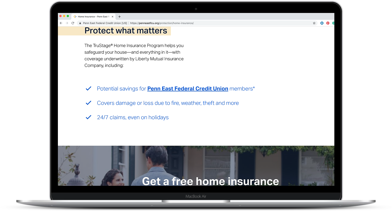
This webpage on PennEastFCU.org demonstrates clear and concise writing that speaks directly to what the reader wants to know.
Prioritize
Before you start writing, make sure you know your purpose and your audience. What is important to them? What are they trying to find? Then prioritize the information you have to convey and put the most important elements first. This tactic is called the “inverted pyramid model.” Put key messages at the top and then follow with supporting information and details. Convince them it’s worth it to stay by providing the value succinctly upfront.
So when it comes to your credit union website, just remember that less is often more. If you’re interested in additional information on optimizing your website content, check out our article on seven research-backed tips for writing copy that succeeds.
Curious how else you can optimize your website to grow your credit union? Check out our Credit Union Website Strategy Guide.