We’ve all experienced what it’s like to use a website with awful navigation: it’s about as appealing as playing leapfrog with unicorns. Moreover, if you offer lots of products and services—and credit unions offer dozens—then navigation is even more important. That’s why navigation can make or break your credit union website design.
As BloomCU has worked with credit unions to craft website navigation systems, we’ve explored many different designs. One concept that’s crossed our plate more than once is to replace noun-based labels with verbs.
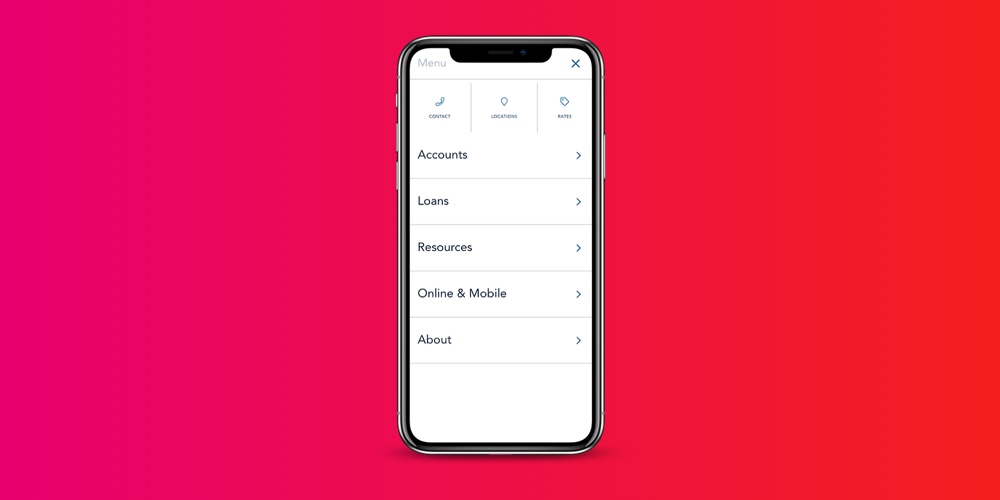
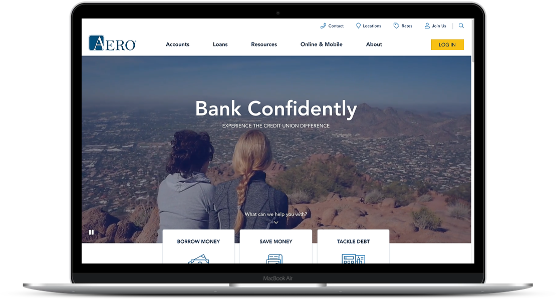
 AeroFed.net, a credit union website designed by BloomCU, uses noun-based labels in its navigation.
The idea is to replace nouns like Accounts, Cards, and Loans with verb-based labels like Save, Spend, and Borrow. On its face, it seems like a promising concept because verbs evoke action and using them as labels is unconventional, which should cause them to stand out.
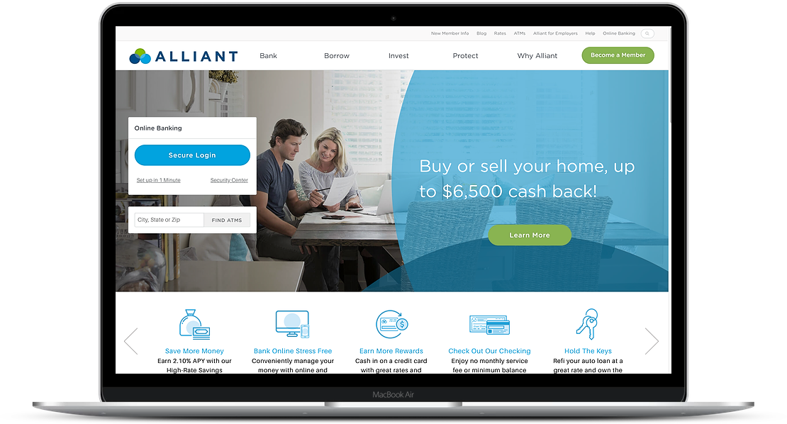
 AlliantCreditUnion.org uses verb-based labels in its navigation.
We decided to test it
To learn the truth of the matter, we put it to a test. We designed two prototypes and conducted a usability study with ten consumers to see how long it would take them to find certain pages using noun- or verb-based labels. The study participants were given these six tasks:
- Find a page where you can learn about purchasing a new home
- Find a page where you can apply for a Visa debit card
- Find a page where you can download the iOS banking app
- Find a page where you can see job openings at the credit union
- Find a page where you can learn how to send money to a friend
- Start an application to become a member of the credit union
The Results
The study results are intriguing. As it turns out, noun-based labels are nearly twice as easy for website users.
Verb-Based Labels |
Noun-Based Labels |
|
| Home Purchase | 17.8s | 9.6s |
| Debit Card | 23.6s | 4.4s |
| Download App | 27.6s | 7s |
| Job Openings | 8.6s | 11.6s |
| Send Money | 21.75s | 15.8s |
| Join the CU | 5s | 17.6s |
19.8s |
10.6s |
This table shows how many seconds users took to find the correct pages when presented with verb- or noun-based labels.
When given verb-based labels, users took a median of 19.8 seconds to find the correct pages. On the other hand, when given nouns, they took only 10.6 seconds. The takeaway is obvious: use nouns for your navigation rather than verbs.
