
According to consumer behavior studies, the average consumer needs to see an ad at least three times to remember the product or brand. When a consumer first reads your message, they might just skim over it. The second time they might pay a bit more attention. It’s only by the third time that it actually starts to stick.
So the idea that you should have only one call to action (CTA) per page on your credit union website is a costly myth. Your CTA should be used liberally to maximize its impact. After all, the more CTAs present, the more chances a user has to convert.
A test on GoodUI found an 84% increase in conversions simply by adding more calls to action to the page.The control page only had CTAs at the top of the page and converted at just 7%. The variation page added repeated CTAs to the bottom of the page and converted at 12.8%.
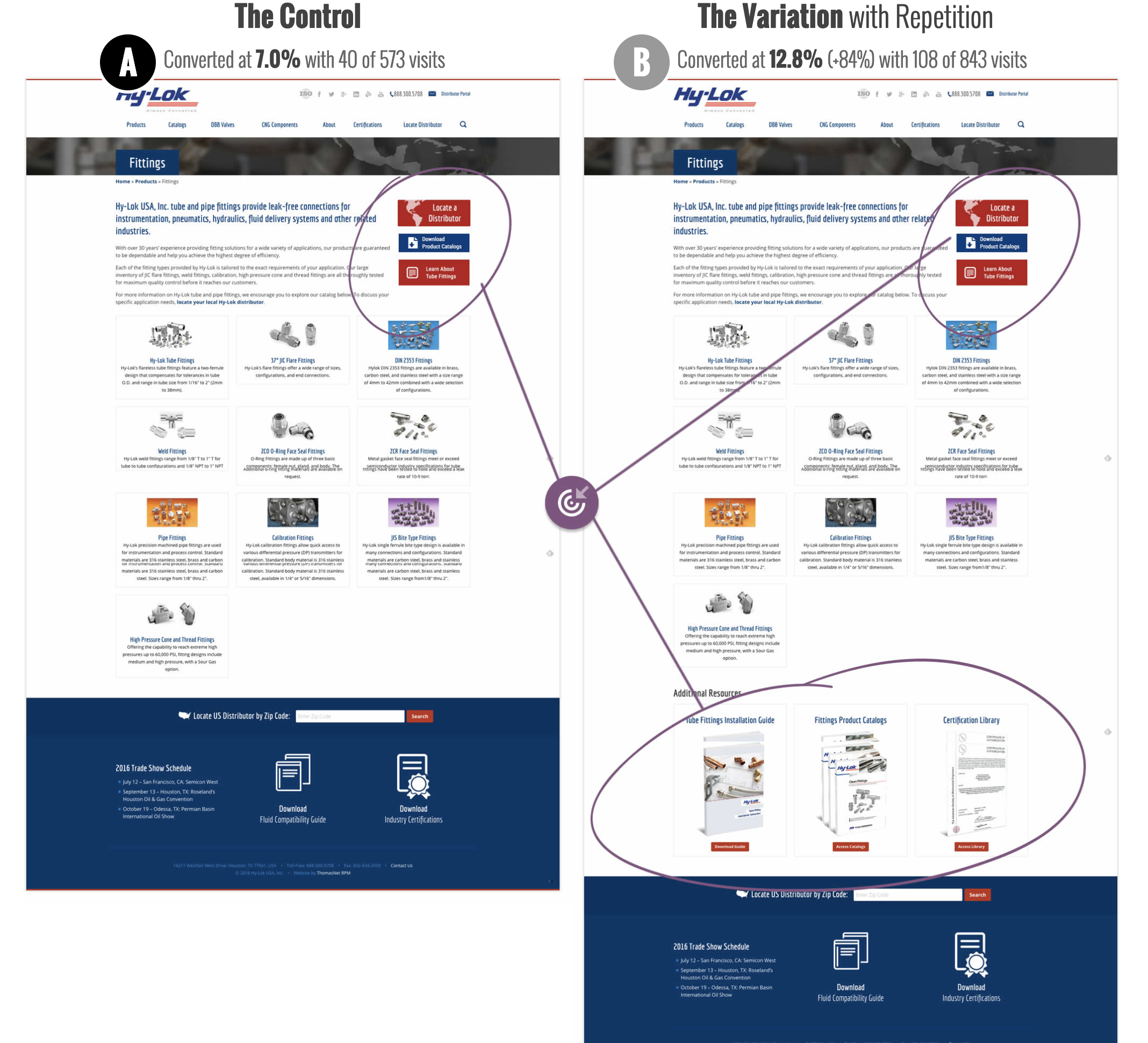 Image by GoodUI
Repeated CTAs can increase the number of clicks you get. You just have to make sure you’re repeating the right way in order to see those positive results.
Ask for one thing
Repeat the same CTA. In other words, ask users for just one thing per page. Our brains automatically scan material for themes and patterns, so capitalize on this habit by using a recurring phrase for your call to action.
Having different calls to action on the same page is where you start to confuse users. If you present them with too many options (get a quote, request a demo, download this e-book, etc), choice paralysis can set in, and they may not take action at all.
Pay attention to the length of the page
The number of CTAs you have on a page depends on its length. The longer the page, the more times you’ll need to repeat the call to action. If your reader gets halfway down a page and is ready to convert, make sure they have the opportunity to do so—don’t make them wait until the end. An easy rule of thumb is if you’re scrolling through the page and see the same CTA more than once at the same time you’re scrolling, you might be overdoing it and come across as nagging. Shoot to include a CTA every two to three sections.
Don’t forget above and below the fold
Most of the time it’s a good idea to have your first CTA above the fold (the area visitors see without scrolling) where visibility is highest, followed by repeated CTAs below the fold. However, if you’re selling a complicated product or one that requires more investment, you may want to consider placing your first CTA below the fold where people will see it after they’ve read copy that prepares them to convert. Make sure the placement of your CTAs is appropriate for your product and audience.
Here at BloomCU, we’re giving repetition a test of our own. We are currently running an A/B test on Voyage Federal Credit Union. The original page has just one CTA button at the bottom of the page.
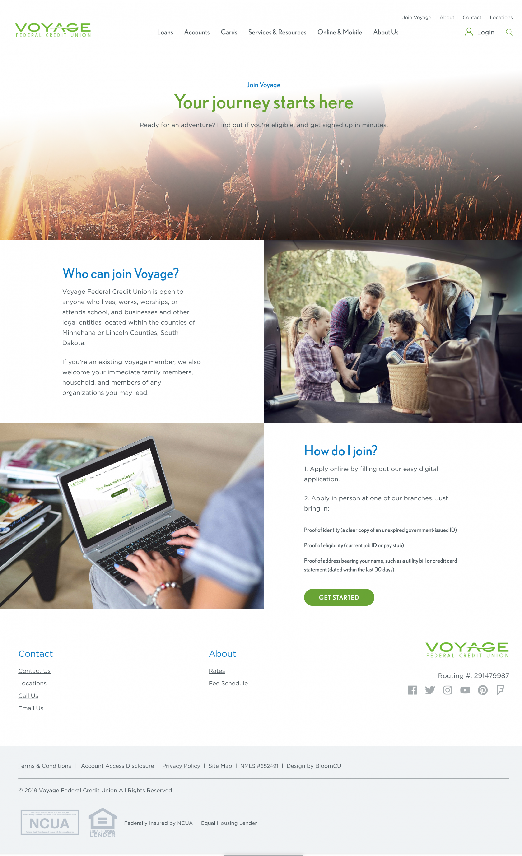 Original webpage with just one CTA
The new and improved page we created has CTAs throughout the page, one above the fold followed by three others farther down the page (all with the same call to action of “Get Started”). Stay tuned for the results!
 New webpage with repeated CTAs throughout the page.
For more tips on optimizing your CTAs, check out this blog.