
Are you spending money appropriately on your credit union website design? Or are you throwing money around like a belligerent toddler throwing spaghetti at the wall, hoping something sticks? Based on the latest and greatest research, here’s what will give you the most bang for your buck—and what’s probably a marina-coated waste of time.
Ways to Waste
#1 Sliders and other blind promotions
Unfortunately, this is too often the first thing you’ll see on a credit union website. That doesn’t mean it’s a good investment. The problem with sliders and other promotions with zero targeting is that they resemble ads—and people tend to ignore things that resemble ads. Fortunately, instead of shouting random promotions at anyone who visits your site, there are other, much more effective ways to use promotions.
#2 Broad/Global/Organic SEO
Many credit union marketers want to include SEO on their website, but don’t understand what kind of SEO should take priority. So they spend money on expensive SEO services and upgrades, all the while ignoring the low-hanging fruit that would give them the highest rate of return.
Unless you are a truly massive, nationwide credit union (think Navy Federal), there’s not much point in trying to become the number one search result for “Auto Loans” all across the U.S. This is partly because it would be incredibly difficult to accomplish this goal, and partly because this goal doesn’t benefit you in the long run. If your credit union only serves people in Carolina, it doesn’t really matter what your search results are in Washington State. Instead, make it a point to become a master of local SEO. Spend your time looking at trends and search results in your service area, and make sure you take a good look at your reviews on Google Places, Facebook, and other local social media sites.
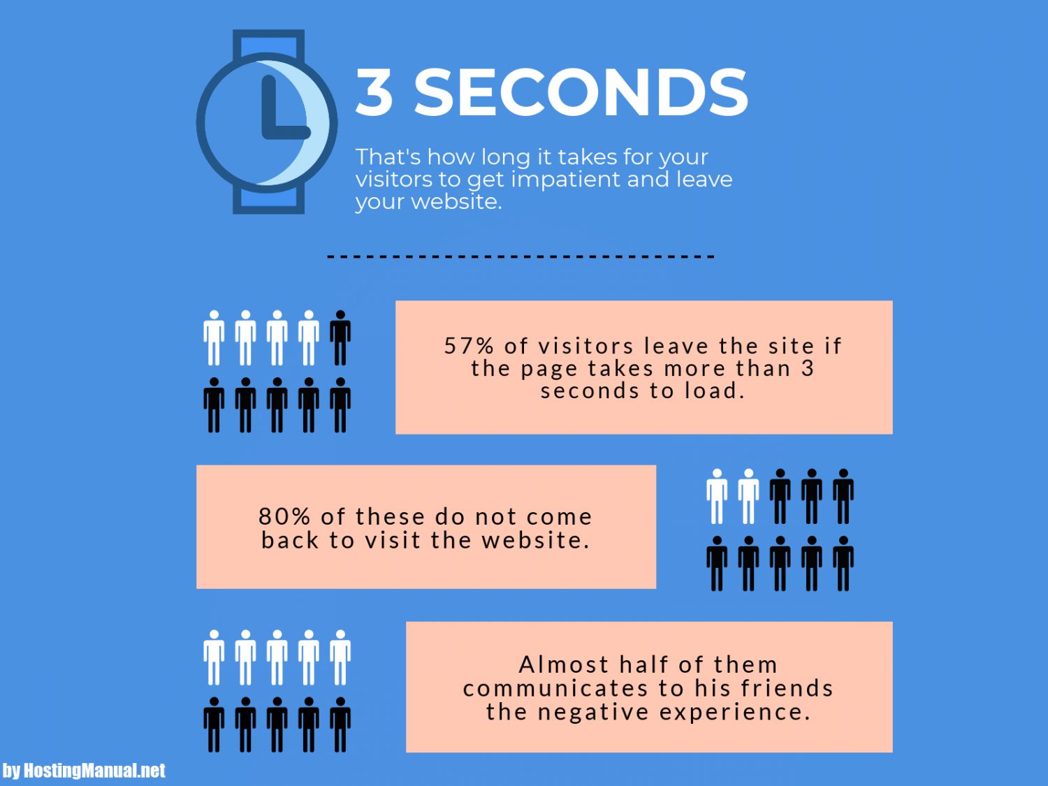
#3 Anything that bogs down your load times
People hate slow websites. Websites that do not load fast enough take big hits on traffic, conversion rates, and overall user satisfaction. In just one study, Google found that 53% of mobile users abandoned a website if it didn’t load in the first three seconds.
 Cool tech is great on sites and can help you attract younger members. However, you have to make sure that your site is built to support that tech. Pick a highly-rated web host in the first place, and don’t add anything to your site that will significantly compromise how fast it loads. No fancy background video, interactive quiz, or state of the art account opening system is worth a site that feels broken.
Ways to Win
Don’t worry, it’s not all bad news. If you focus on these three big wins, you’ll have a website that’s as satisfying as a gourmet meal.
#1 Personalization
Personalization is the fine art of giving people a custom experience when they visit your website, based on their past behavior. For example, those who mostly use your site to access online would get an interface that makes it easy to log right in. On the other hand, those who have expressed an interest in your auto loans might see a homepage that shows them the latest loan rates or links to blog posts with car buying tips.
At BloomCU, we are huge on personalization, and for good reason. A recent experiment we did on personalization yielded some pretty awesome results, including an over 200% increase in engagement.
#2 Seamless Navigation
Credit union websites are too hard to get around! Whether it’s endless navigation items in the menu, no menu at all, or a broken search functionality, the sins are many but the results are all the same: unhappy visitors. Fixing up your navigation is an easy win that helps people easily find your products and sign up for them while feeling great about your brand and site.
#3 Beautiful Imagery
 This warm, inviting picture seems to say, “You can trust us with your retirement savings.”
The truth hurts sometimes. People trust websites more when they are beautiful. Attractive, authentic imagery captivates people and helps them stick around on your site. It establishes your brand, sets a tone for your site, and even sets people at ease. Not sure what makes a great image? Check out our post on selecting fantastic images for your site (and how it can boost your conversions).