First impressions matter. If people got past first impressions quickly, then Pride and Prejudice would be a short story, not a 300+ page novel. Job interviews wouldn’t feel so stressful, and we’d all probably forget that horrible date we went on one time. But first impressions tend to linger. On your credit union website, you only have one chance to make a first impression, and first-time visitors almost always view your homepage. That’s why your homepage is so vital. If you want users to have a great experience on your website (and sign up for more loans and accounts) then you need to dazzle them with your home page. This post outlines every element you’ll need to do just that.
Basic Homepage Elements
Does your homepage look like a homepage? According to an extensive study done by the Big Guys themselves—Google—people are really, really into prototypicality; for many prototypicality is a defining quality of beautiful websites. What is prototypicality? It’s a fancy word for “something that looks and functions how you would expect.” For example, a “prototypical” apple would be red and round, even though there are many types of apples in the world that don’t fit that description.
If your homepage is missing (or accidentally hiding) fundamental homepage elements, you’re going to have some unsatisfied visitors. This graphic shows key elements that should be on almost any homepage, and certainly on any credit union site:
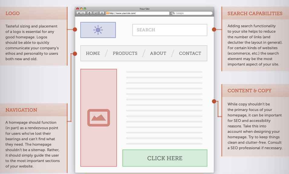
Source: Kissmetrics
Let’s dive a little deeper into this graphic, noting how each of the key elements applies to credit unions.
Logo: Your logo is your brand mark that connects your various physical branches, advertising, and website in the minds of your members and potential members. So, your logo should be prominent on your home page (and every other page of your website).
Navigation and search: These need to be obvious on your home page, and organized in a way that will make sense to visitors. If people can’t find the products they want on your website, how will they apply for them? You can do Usability Testing to improve your navigation menu. Especially make sure your contact info is easy to find, because 44% of visitors will leave a website if they can’t find contact information. You might also want to consider a real-time search feature that makes it easier for users to find the accounts, credit cards, and loans as they type.
Content and copy: Your images and messaging define your brand. Therefore, your content should succinctly sum up what makes you special as a credit union, and what differentiates you from other financial institutions you compete against. Additionally, rich content is good for SEO and help you show up in Google’s search results.
Other important elements
These are other important homepage elements that apply specifically to credit union website design. While every single element below may not apply to your own homepage goals or needs, you should seriously consider these possibilities, since they can make a significant difference in terms of site usability and conversions.
Log in to online banking
This is the primary reason members visit your website. Again, stick with prototypicality and consider sticking the login in the upper right corner of your page. Visitors will have an easy time finding it there, because that’s where the login is on many of the most popular websites, such as Facebook and Gmail. According to the data experts at the Nielsen Norman Group, it’s essential to put important page elements where they’re most likely to be found.
Interactive elements
According to Kapost, interactive content generates twice as many conversions as passive content. Interactivity builds a relationship with the site visitor and encourages them to convert. On websites we’ve built for credit unions, we have included interactive content in the form of quick quizzes, interactive calculators, artificially intelligent chatbots, and interactive navigation interfaces.
Social proof

A testimonial featured on United Texas FCU’s homepage
Humans are naturally social. We love what other people love. According to Social Fresh, testimonials have the highest effectiveness of any kind of content marketing. Your homepage is a great place to feature a well-worded testimonial or two. When adding testimonials to your credit union website design, you want them to sound real. So, keep testimonials relevant, add a friendly face, and don’t fake it.
Personalization
Who doesn’t want a site that caters to their exact needs? One study by Forrester found that “77% of consumers have chosen, recommended, or paid more for a brand that provides a personalized service or experience.” A homepage that changes according to a user’s behavior shows both care for the member and your technological prowess. If you’re interested in adding personalization to your homepage, check out these resources:
- Demo of Personalization on bloomcu.com
- How to personalize your credit union website & increase member engagement
- The most impactful new trend in credit union website design
- Why Personalization is the Most Impactful New Trend in Credit Union Website Design
Additional Resources:
- https://blog.hubspot.com/blog/tabid/6307/bid/31097/12-critical-elements-every-homepage-must-have-infographic.aspx
- https://blog.kissmetrics.com/ultimate-home-page-headline/https://blog.kissmetrics.com/what-converting-websites-do/
- https://blog.hubspot.com/marketing/compelling-stats-website-design-optimization-list
- https://www.cuinsight.com/upgrade-credit-union-website-design-5-seconds.html
Get our crazy ideas and doable tips in your inbox.Want more insights?