The balance of elements within a design impacts its usefulness and aesthetic
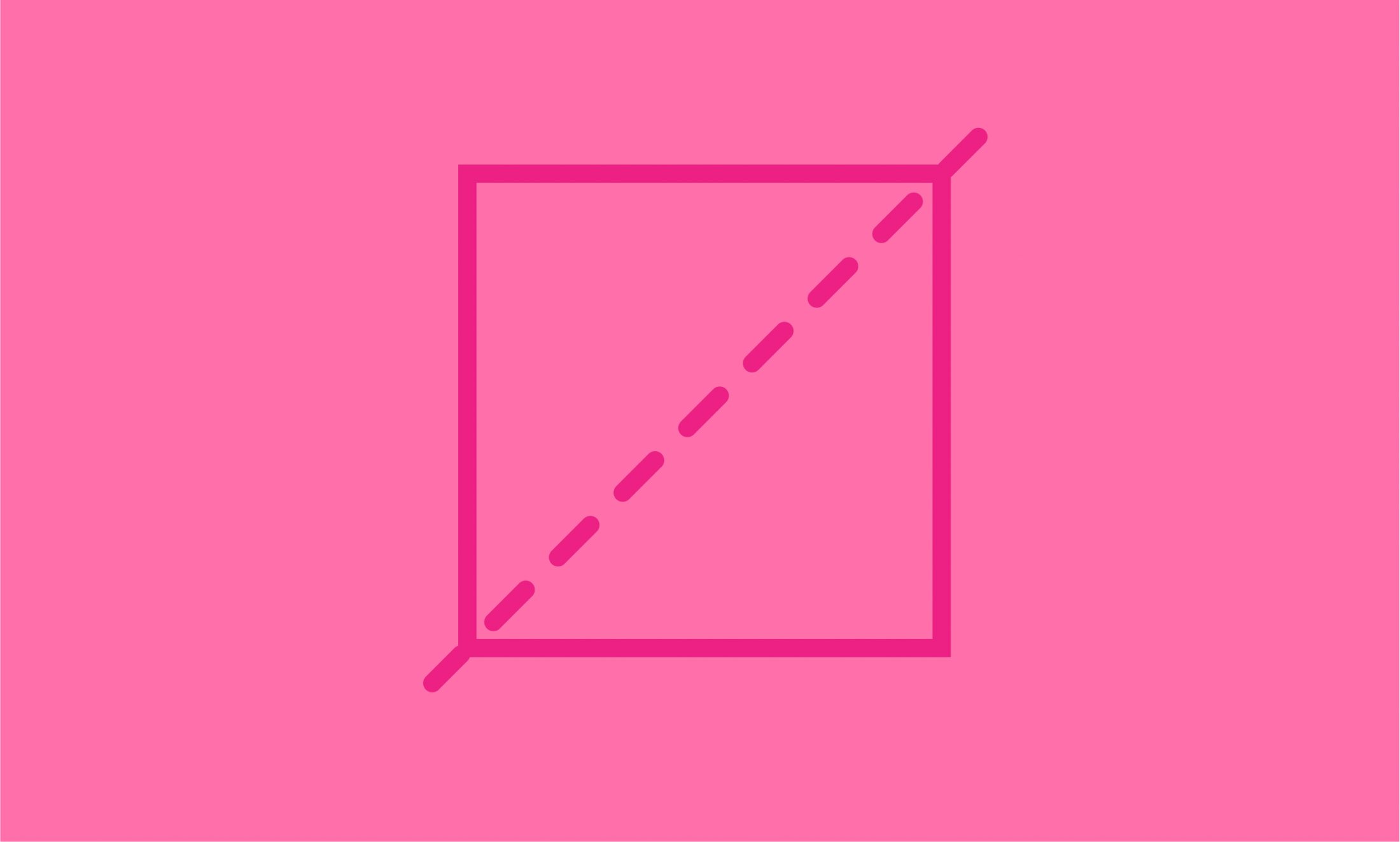
Symmetry is used in all forms of art and studied in all branches of science.* It exists all around us: in the device you are using to read this; in Einstein’s E=mc2; in Newton’s third law of motion, “For every action, there is an equal and opposite reaction”; in your body (you have two eyes, ears, hands, etc.); and even in your beliefs about justice, fairness, and dialog. Accordingly, designers can use symmetry to make their designs more practical and attractive.
Have you ever seen a website that looks like a hodgepodge? Chances are it was not very appealing or user friendly because the human brain prefers some balance and symmetry in designs. For example, using consistent shapes, sizes, and patterns creates balance that is both useful and beautiful.
*Source: Wikipedia.org, Symmetry
Takeaways
- Use consistent spacing, shapes, sizes, and patterns to create balance
- Make a website style guide to maintain symmetry throughout your design
Get the Poster
We designed a sweet poster that explains and depicts the Law of Symmetry. If you want a copy, just enter your name and email address below and we’ll email you the poster.
5 More Laws of Credit Union Website Design
If you’ve enjoyed learning about the Law of Symmetry, then check out our article 5 Laws of Credit Union Website Design to learn about other laws of design.