Four key principles of trust for credit union web design
They say in relationships if you don’t have trust, you don’t have anything. This is good advice for anyone, but especially for credit unions. In your line of work, trust is essential. If you’re going to persuade potential members to choose you over bigger, more established banks, they have to trust you can take care of their money and their future. Trust is non-negotiable.
The most obvious way to foster trust and build confidence is to actually be trustworthy. Consistent good behavior builds your reputation and helps you win more members through word of mouth. But that’s not enough.
Through every touch point with members and nonmembers, you should be communicating your trustworthiness. This includes your website, which is the face of your brand. Nonmembers and members alike interact with you more online than anywhere else. Your home page is where they will go first to find out more about your credit union and its services. When they land on your credit union website design, do they feel welcome, at home, and safe in your hands?
What makes a credit union website design trustworthy?
Consumers can easily lose confidence in institutions, although they may not be able to explain why. Here are some thoughts that may pop into their heads when looking at a website they find suspicious:
- “Something feels off.”
- “I don’t like the way it looks.”
- “Ugh, doing business with these guys is probably the same as using their website: not pleasant.”
- “If their website is old-looking, is everything (like online banking) secure?”
Their behavior illuminates certain marketing trends that you can decode by figuring out which websites are abandoned quickly, and which encourage users to linger longer, or even make a purchase.
We dove into the research on website layout and design so you don’t have to. What we found are four key trust factors: beauty, simplicity, prototypicality and transparency.
Principle #1: Beauty
It seems a little shallow, but it’s an indisputable fact: people are attracted to beauty and repulsed by “ugly.”
Have you ever got a pop-up ad that claimed you’ve won hundreds of dollars? What tipped you off that it was fake? The sloppy, unpolished design was probably your first clue. Similarly, you’ve probably landed on a site at some point that looked like a time portal back to 1995; and like most people, you probably quickly hit the back button rather than sticking around.
Some tips for making a website beautiful are obvious, e.g. if you’re using Comic Sans, you should stop—immediately. However, there are underlying principles beneath these guidelines that make up the foundation of a trusting relationship.
Principle #2: Simplicity
In 2012, Google honed in on why people find certain websites beautiful (and others ugly). They discovered that consumers like simplicity, or a lack of visual complexity. Jony Ive, Chief Designer at Apple, explained our attraction to simplicity like this: “Why do we assume simple is good? Because with physical products we have to feel we can dominate them. As we bring order to complexity, you find a way to make the product defer to you.”
If something is simple, it’s not threatening. That’s why we’re more likely to trust it, and admire its beauty.
Take a look at this website featured on the Hubspot Blog:
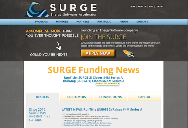
Original website design
The original website design (above) is cluttered with too much information, too many design elements, and a wide variety of colors and textures. The result is a website that’s too busy, too complicated, and too difficult to grasp. It’s overwhelming and unsettling. If you came across this website, would you want to apply to Surge for funding? I know I wouldn’t.
Now take a look at the redesign:
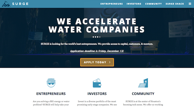
Simplified website design
The redesigned website is much simpler and a kajillion times more professional. The clean lines, simple color scheme, and abundant white space put us at ease. This is a company you want to learn more about.
Principle #3: Prototypicality
Prototypicality refers to the the idea that most people unconsciously gravitate to the most “typical” version of a thing. Let’s say you hear the word “apple.” You’re likely to think of a piece of fruit that’s round and red (or green), even though there are many apples that don’t fit that description. Prototypicality promotes trust because it stays within people’s expectations. They like familiarity, and prefer not to be jarred by odd twists or turns. Take a look at this example from Tutsplus, a site that teaches people how to create better websites:

This is a webstore, but it doesn’t look like one. It’s more like how you might imagine a personal blog to look, which is why it feels inherently less professional, and less trustworthy.
Now here’s the redesign:

This prototypical webstore interface is much more appealing. It’s not only more aesthetically attractive, it’s also more like what customers expect to see when they’re looking to purchase a tie. And it’s more effective. When Skinny Ties implemented this new design, their revenue got a 42.4% boost.
Principle #4: Transparency
In credit union design, there’s a temptation to hide features behind paywalls, click-throughs, or other barriers. While this can be useful in terms of increasing conversions and engagements, you end up alienating users if you take it too far. A good rule of thumb for walking the line is “relevance”. Ask yourself, for a typical credit union website visitor, what information is relevant? If you have information that will help them find their way and make decisions, don’t withhold it.
GoodUI conducted a test in which they revealed more information to the user about available options. As a result, GoodUI doubled its conversion rate from 1.2% to 2.4%.
The takeaway is this: don’t withhold information that’s relevant to a user , especially when there’s no strategic reason for it. That’s just laziness.
For example, you should always, always make some kind of contact info available on your website. A recent study from Huff Industrial Marketing, KoMarketing, & BuyerZone found that 44% of users said they would leave a vendor website that had no contact information. For transparency’s sake, you should also have a navigation bar of some sort so that users can find what they need without getting frustrated. These are simple design choices with big payoffs.
Conclusion
Good design is about more than being “cool” or “modern.” Good design solves problems, molds perceptions, and shapes the future of your credit union. Good design can make or break the fragile bonds of internet trust. So, use beauty, simplicity, prototypicality, and transparency to create a credit union design people trust.
Want more insights?
Get our crazy ideas and doable tips in your inbox.