Your navigation menu can make or break your credit union website design. It’s one of the most important parts of your website because that’s how users flow through the site and find information (other than using search). And navigation has to be especially easy-to-use for mobile devices, where space is limited.
Insights from the Nielsen Norman Group
Because website navigation is so important, we’ve done a lot of reading to learn valuable insights and best practices. One of the best resources we’ve found is the Nielsen Norman Group (NN/g). In their own words, “NN/g conducts groundbreaking research, evaluates user interfaces, and reports real findings – not just what’s popular or expected. With our approach, NN/g will help you create better user experiences and improve the bottom line for your business.”
Below, you’ll find six insights that will make your mobile navigation better.
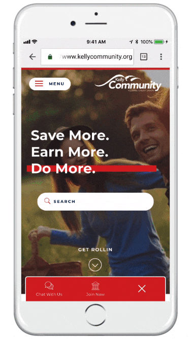 KellyCommunity.org, a CUNA Diamond-Award-winning website designed by BloomCU, demonstrates all six insights listed below.
- Place menus and buttons at the bottom of the screen where thumbs can easily reach them.
- Make the menu stand out, visually.
- Make the menu look tappable (e.g., make it look like a button).
- Consider making menus “sticky” (i.e., stays in place as you scroll) so they are always accessible.
- Expose important options rather than hiding everything behind a hamburger icon.
- If you use a hamburger icon, give it a label (e.g., “Menu”) to help users identify it more quickly.