If a stranger walked up to you on the street and asked you for your name, email, home address, and phone number, would you answer them?
Asking for people’s information is a big request. Your website probably has plenty of forms used to generate leads and applications. By default, people are wary of giving out their information, so you need to make forms appear trustworthy and easy. Otherwise you’ll lose out on conversions.
In fact, the specific way you collect information directly impacts the volume of people who are willing to give it. There are certain form techniques that are intimidating and off-putting, even if just subconsciously. Other techniques invite users to give you their information more quickly and freely, which means more borrowers and members for your credit union, in the long run.
Below are seven form techniques you can employ in your own credit union website design. Each technique is supported by evidence from detailed experiments.
An example of a form in a credit union website design
#1 Use fewer form fields
Fields refer to the items on your form, such as “name” or “email”. Using fewer form fields is a technique that has been replicated many times with significant success. When Imagescape reduced the number of fields on their forms from 11 to 4, they more than doubled their conversion rate.
GoodUI’s recent Data Stories newsletter featured a whole section on why less is more when it comes to form fields. Across multiple studies, they found removing fields encouraged more people to finish the form, whether that was by removing the email confirmation field, a coupon code field, or a series of drop-down menus. Overall they, found a 11.5% increase in conversions.
Of course, there are some fields you absolutely need if you want to generate qualified leads. How will you contact someone if you don’t have their email or phone number? And if you need to run a credit check, you’ll have to ask for more than that. However, double check your form fields to make sure you are not asking for anything you don’t absolutely need. For example, asking for gender or income might be useful for demographic data, but could reduce the number of people who complete the form and may not actually be needed.
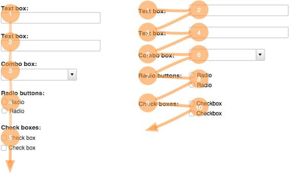
#2 Use a single column
Conversion Xl discovered single-column forms are fastest to complete, and thus more likely to be completed. In their experiment, participants completed single-column form an average of 15.4 seconds faster than a multi-column one. A double column form might seem tempting for the layout you are using, but it’s harder for users to jump from field to field this way.

Single column vs. Double column
#3 Put form labels on top
In a similar principle, putting the labels on your forms directly above the fields (and making them left-aligned) makes them easier to read. Google UX found a significant increase in conversions* when they tested labels on top versus labels that were adjacent to the fields. As you can see from the graphic below, the top and left labels require less effort from the eyes than the adjacent labels shown on the right.
An examination of top aligned labels from VentureHarbour.
#4 Order fields from easiest to hardest to fill out
Dr. Robert Cialdini, a prominent psychologist, wrote Influence: The Psychology of Persuasion, which covers his research into what techniques encourage people to say “yes”. In the book, he explained when people take a small step towards completing a project, they feel more interested in finishing the whole project. The “easy win” provides motivation. For example, in one experiment, a health center had patients write down the info on their future appointment reminder cards themselves, rather than having the staff write it down for them. This small change reduced missed appointments at the center by 18%.
That’s why you should order your form fields from easiest to hardest. Once you lead a visitor to fill out something easy, like their name, they will be more compelled to finish the rest of the form.
#5 Avoid captchas
Captchas slow people down big time. Stanford performed a study that suggested using a Captcha on a form will reduce your leads by up to 30%. Web company Animoto removed captchas from their sign-up form and ended up with 33.3% more sign-ups.
If you have problems with spam submissions on your site, you might try using an automated spam prevention service, such as Akismet, rather than a captcha.
#6 Don’t use the word “Submit”
In one study, unbounce.com found that using “submit” caused an almost 3% decrease in conversions. In general, submission buttons that are less committal or more specific to the form tend to do better. For a credit union website design, you might use “Apply”, “Reach out” or “Go” instead. Our previous post on calls to action discusses in-depth why people prefer non-committal buttons.
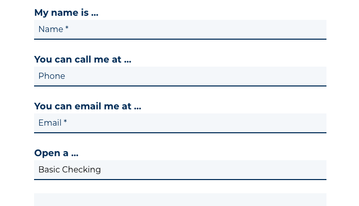
#7 Try Natural Language
GoodUI ran a study where forms using natural language (as in the example below), rather than traditional fields, converted 12% higher. It’s a less traditional method of form writing, but it’s definitely worth trying out on your website. Instead of using standard fields, write a sample message and the make your fields fill in the blanks instead.

A form with natural language
Natural language demonstrates authenticity, and people are drawn to authenticity. It leads to greater brand trust and appreciation.
Want more insights?
Get our crazy ideas and doable tips in your inbox.
*Source: https://research.googleblog.com/2014/07/simple-is-better-making-your-web-forms.html